Review Of SlickCharts
Contents
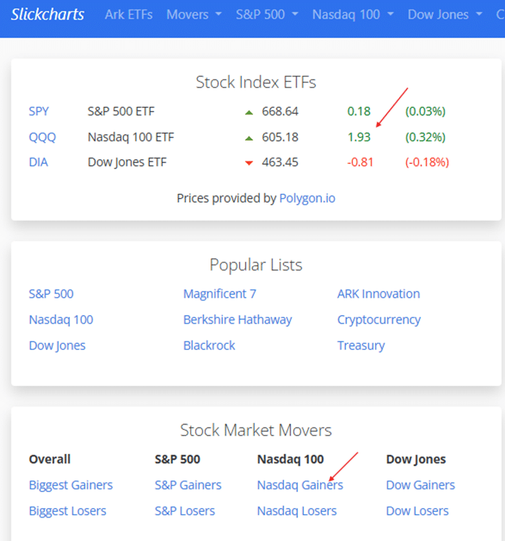
One glance at the home page of SlickCharts.com and I can tell today’s market is mixed, with Nasdaq (QQQ) doing the best, the Dow Jones (DIA) in the negative, and the S&P 500 (SPY) slightly positive:
Since technology stocks in the Nasdaq QQQ are doing so well relative to others, I might want to initiate a bull put spread on a technology stock.
But which one?
There are about 100 stocks in the QQQ.
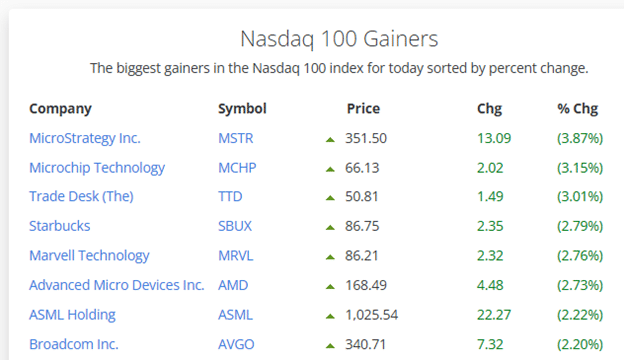
I can click on “Nasdaq Gainers”…
And I got a whole list of possibilities already sorted for me.
The top gainer today is MicroStrategy Inc. (MSTR) with a 3.87% gain just in the morning session.
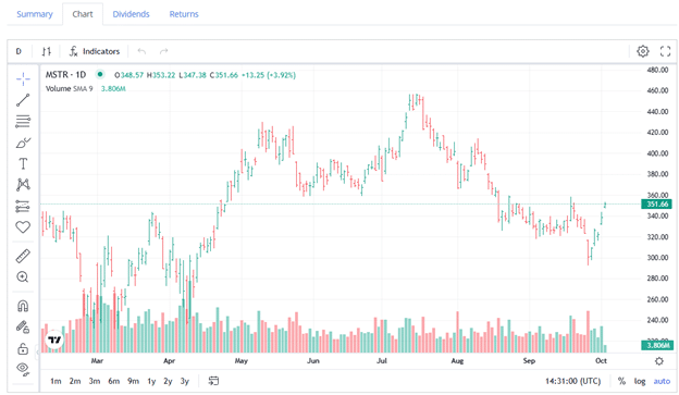
Clicking on it, I get a chart…
It is the fourth day in a row that it is up.
Perhaps it is now too extended on the upside.
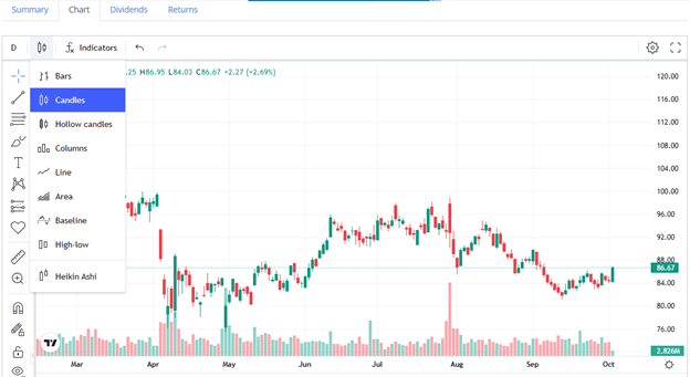
So then I might go to another well-known symbol at the top of the list: SBUX.
Notice that I can change the SBUX chart to candles instead of bars – if that is your preference.
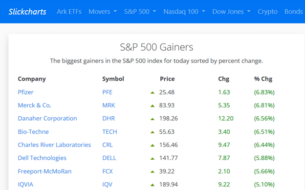
If you prefer to trade the S&P 500 companies, which are the largest publicly traded companies in the United States, then a glance at S&P 500 Gainers can give you a few charts to review…
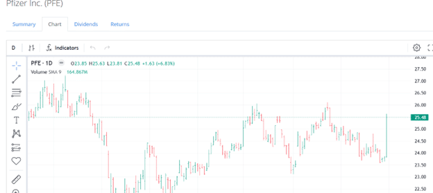
What is going on with Pfizer with a nearly 7% gain?
If I click on the link for PFE:
OMG! Look at that big green candle for the day.
This gives an investor or an option trader a potential bullish trade idea.
What I like about SlickCharts’ “Top Gainers” lists is that they focus on established companies that are part of large index benchmarks rather than the entire stock universe.
This makes it much more relevant for traders or investors who focus on blue-chip or institutional-quality stocks.
Many other platforms rank gainers across all listed securities, which often results in a flood of low-float, high-beta penny stocks—the kind of volatile names I prefer to avoid.
As a side note:
Low-float means stocks with a small number of shares available for public trading, which often makes them more volatile.
High-beta stocks mean stocks that move more sharply than the overall market, indicating higher risk and higher potential reward.
Penny stocks are very low-priced stocks, usually under $5, often from small or speculative companies with high volatility and low liquidity.
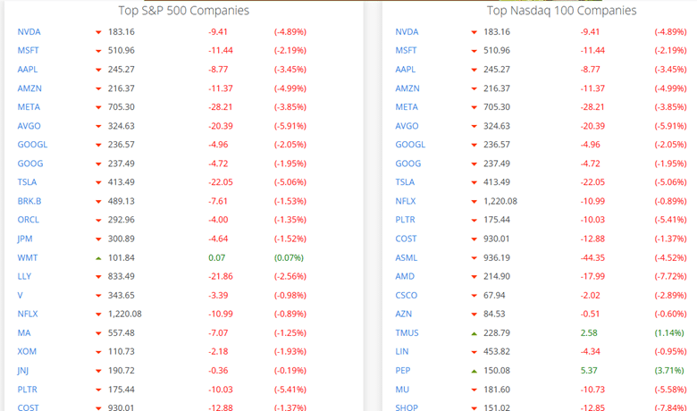
If you had scrolled down to this section of the SlickCharts home page at the end of the session on October 10, 2025, you would have seen a sea of red…
No need to even look at the chart to know that something bad is happening in the market.
This quickly gives you a snapshot of the market’s health for the day.
It also lets you pick out islands of gems that are outperforming while all others are selling off.
In particular, PEP, TMUS, and WMT are the few that are still showing green.
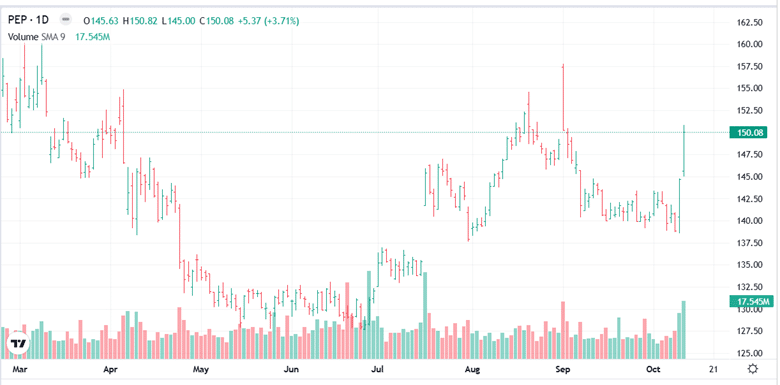
PEP looks particularly interesting, as it is up 3.7% while most stocks are down.
Let’s take a look…
Amazing! PEP is showing such relative strength on high volume on such a bearish day.
Further investigation shows that this is a follow-through on the positive response from an earnings announcement.
So if a trader believes the market will rebound the next day and wants a bullish trade idea, then PEP shows potential—and it can be found in a couple of clicks in SlickCharts.
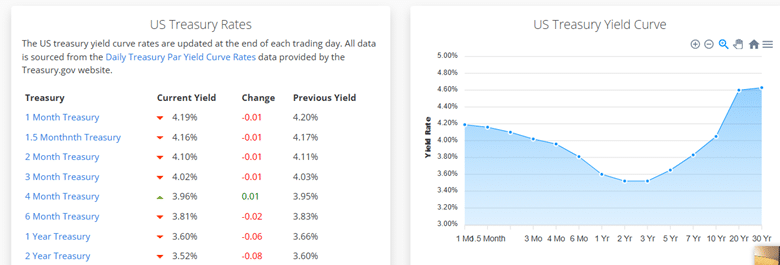
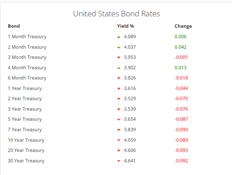
A single click on the top menu gives you the US Treasury Rates and their Yield Curve…
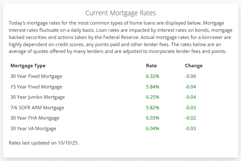
Or if someone is looking for house loans, mortgage rates may be of interest…
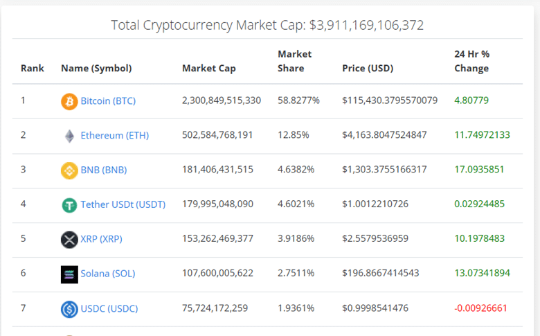
Exchange rates of Crypto Currencies…
Bond Rates…
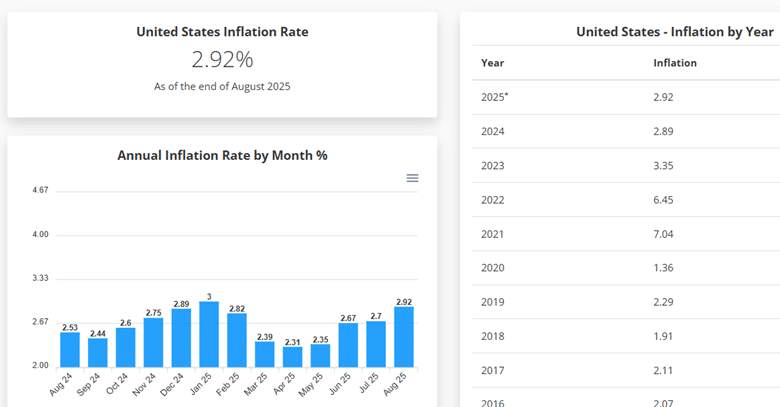
And inflation…
SlickCharts is not fancy, but it is slick.
We hope you enjoyed this review article on Slickcharts.
If you have any questions, please send an email or leave a comment below.
Trade safe!
Disclaimer: The information above is for educational purposes only and should not be treated as investment advice. The strategy presented would not be suitable for investors who are not familiar with exchange traded options. Any readers interested in this strategy should do their own research and seek advice from a licensed financial adviser.
Source link