HOW I IDENTIFIED AND EXITED AT THE MARKET TOP IN 2000–WHEN THE 30 WEEK AVERAGE CURVED DOWN. TO IDENTIFY A LIKELY TOP, I JUST WATCH THE 30 WEEK AVERAGE. Compare the weekly charts of QQQ from 2000 and now.
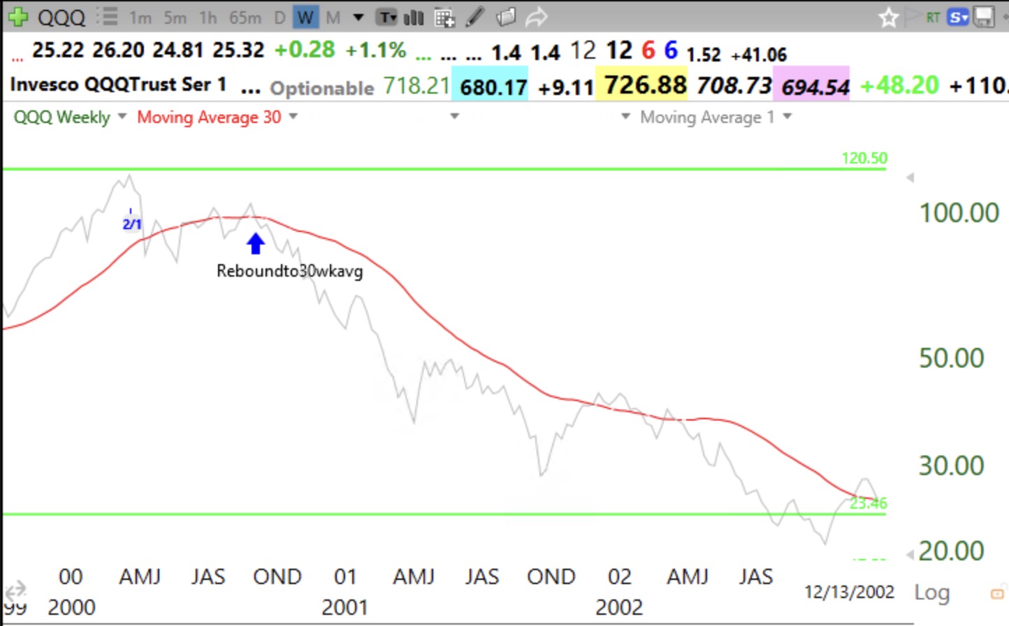
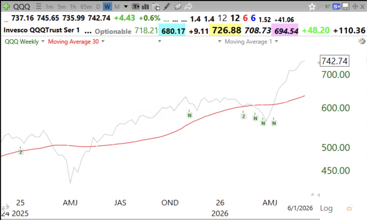
This signal helped me to get out at the beginning of of all major declines since 2000. Here are the 2000 top and today’s chart. Gray line is weekly price closes. Thank you Stan Weinstein for teaching me stage analysis.
I got defensive in April 2025 until the 30 week resumed its rise. Compare these two charts. See a top?
Related
Source link