
Mastering Chart Patterns: A Guide to Successful Technical Analysis
Understanding chart patternsChart patterns are visual formations on price charts that occur due to the behavior of buyers and sellers in the market. These patterns often signal potential future price movement… is fundamental for traders aiming to excel in technical analysis. These visual representations of price movements over time offer critical insights into market trends and potential price shifts. By studying these patterns, traders can make more informed decisions and improve their odds of executing profitable trades. Below is an in-depth lesson on chart patternsChart patterns are visual formations on price charts that occur due to the behavior of buyers and sellers in the market. These patterns often signal potential future price movement…, let’s begin.
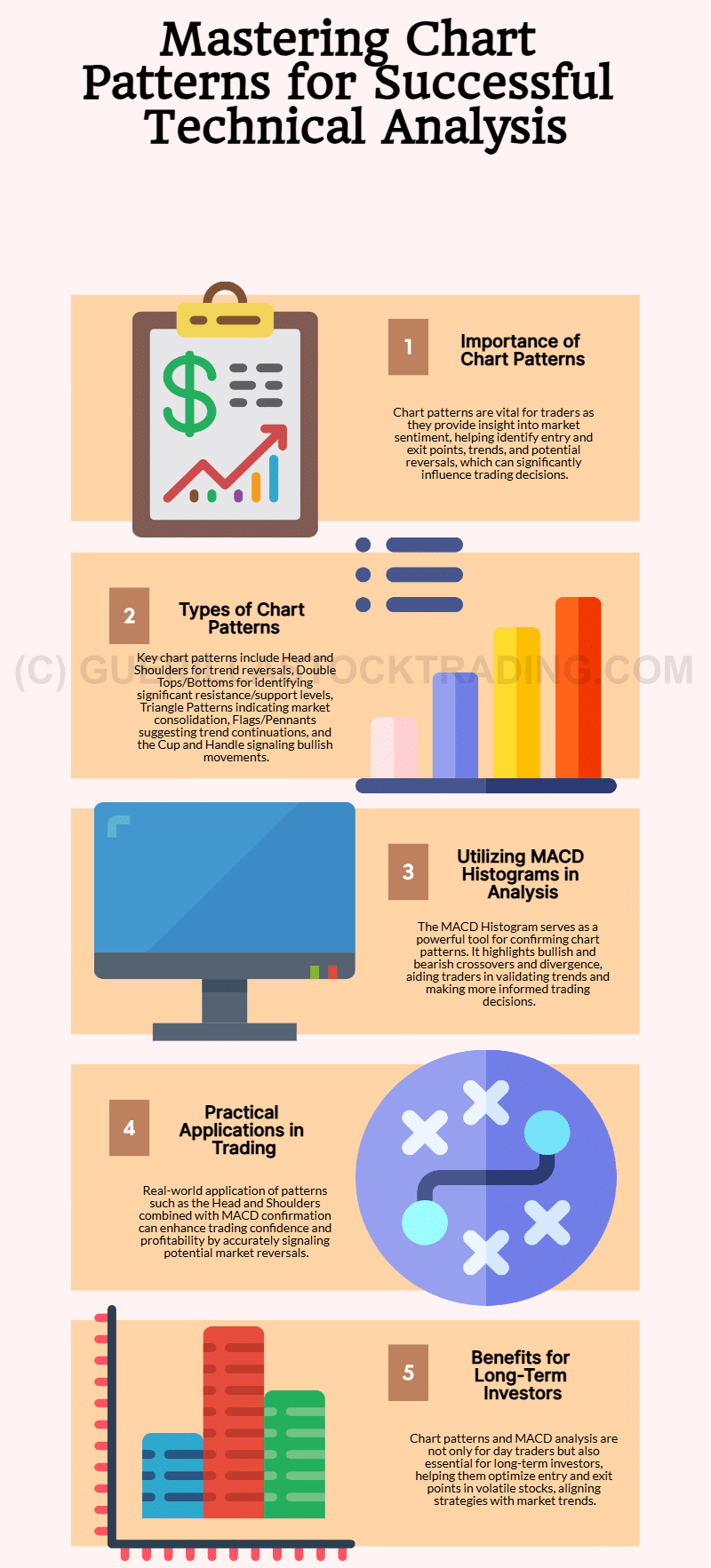
The Significance of Chart Patterns
Chart patternsChart patterns are visual formations on price charts that occur due to the behavior of buyers and sellers in the market. These patterns often signal potential future price movement… serve as a strategic guide for traders, offering a snapshot of market sentiment and the dynamic tug-of-war between buyers and sellers. These patterns help traders identify key entry and exit points, understand trends, and anticipate potential reversals or consolidations. For investors, mastering chart patternsChart patterns are visual formations on price charts that occur due to the behavior of buyers and sellers in the market. These patterns often signal potential future price movement… can mean the difference between capitalizing on opportunities and missing out on market movements.
Common Types of Chart Patterns
Several chart patternsChart patterns are visual formations on price charts that occur due to the behavior of buyers and sellers in the market. These patterns often signal potential future price movement… are instrumental for traders to recognize:
A. Head and Shoulders
The head and shouldersThe head and shoulders chart pattern is a technical analysis tool used in stock trading. It is one of the most well-known and widely recognized chart patterns, and it is used by in… pattern features three peaks: a central peak (the head) flanked by two smaller peaks (the shoulders). This formation often signals a potential trend reversal from bullish to bearish, marking it as a critical indicator for traders seeking to exit long positions or consider short opportunities.
B. Double Top and Double Bottom
Double tops and bottoms highlight resistance or support levels tested twice without breaking. A double topThe double top chart patterns occur when the price of a security makes two successive highs, with a valley in between, before the price begins to decline again. suggests a bearish reversal, while a double bottomThe double bottom chart pattern is a reversal pattern that indicates the exhaustion of a downward trend and the potential for an upward trend. indicates a bullish shift. Recognizing these patterns can guide traders in anticipating significant trend changes.
C. Triangle Patterns
Triangles, including ascending, descending, and symmetrical variations, signify periods of market consolidation. They often precede sharp price movements, offering traders a chance to position themselves ahead of the breakoutBreakout patterns occur when a stock price moves beyond a defined level of support or resistance with increased volume, signaling the potential start of a new trend. A breakout ind….
D. Flags and Pennants
Characterized by an initial sharp price movement (flagpole) followed by a period of consolidation (flag or pennantA pennant pattern is a continuation chart pattern that forms after a strong price movement, typically characterized by a brief period of consolidation before the price resumes its …), these patterns suggest a continuation of the preceding trend. They are especially valuable for traders in trending markets.
E. Cup and Handle
The cup and handleThe cup and handle chart pattern is a widely recognized formation in technical analysis that signals potential bullish price movements. Initially introduced by William J. O’Neil in… pattern, resembling its namesake, signals a bullish continuation. Following a period of consolidation (the handle), traders can anticipate an upward price trajectory, presenting lucrative opportunities.
Leveraging MACD Histograms in Chart Analysis
The Moving AverageThe concept of moving averages dates back to the early 20th century. While it is challenging to attribute the invention of moving averages to a single individual, W. P. Hamilton, a… Convergence Divergence (MACDThe MACD indicator is essentially a momentum indicator that shows the relationship between two different moving averages of price. The MACD is the difference between the 12-period …) Histogram is a widely used technical indicator that enhances the analysis of chart patternsChart patterns are visual formations on price charts that occur due to the behavior of buyers and sellers in the market. These patterns often signal potential future price movement…. It consists of two lines — the MACDThe MACD indicator is essentially a momentum indicator that shows the relationship between two different moving averages of price. The MACD is the difference between the 12-period … line and the signal line — and a histogram that represents the difference between these lines.
The MACDThe MACD indicator is essentially a momentum indicator that shows the relationship between two different moving averages of price. The MACD is the difference between the 12-period … Histogram is particularly effective for identifying trend reversals and validating chart patternsChart patterns are visual formations on price charts that occur due to the behavior of buyers and sellers in the market. These patterns often signal potential future price movement…. By combining visual chart analysis with MACDThe MACD indicator is essentially a momentum indicator that shows the relationship between two different moving averages of price. The MACD is the difference between the 12-period … signals, traders can refine their strategies and enhance decision-making accuracy.
Confirming Chart Patterns with MACD Histograms
A. Bullish Confirmation
When a chart patternChart patterns are visual formations on price charts that occur due to the behavior of buyers and sellers in the market. These patterns often signal potential future price movement… suggests a bullish trend reversal, traders can look for a bullish MACDThe MACD indicator is essentially a momentum indicator that shows the relationship between two different moving averages of price. The MACD is the difference between the 12-period … Histogram crossover. This occurs when the histogram moves above the zero line, reinforcing the validity of the pattern and signaling a potential buy opportunity.
B. Bearish Confirmation
For bearish patterns, a bearish MACDThe MACD indicator is essentially a momentum indicator that shows the relationship between two different moving averages of price. The MACD is the difference between the 12-period … Histogram crossover — where the histogram falls below the zero line — provides confirmation. This signal suggests a sell opportunity aligned with the predicted market trend.
C. Divergence
Divergence arises when price action and the MACDThe MACD indicator is essentially a momentum indicator that shows the relationship between two different moving averages of price. The MACD is the difference between the 12-period … Histogram diverge. For example, if the price hits higher highs while the MACDThe MACD indicator is essentially a momentum indicator that shows the relationship between two different moving averages of price. The MACD is the difference between the 12-period … Histogram records lower highs, it may signal a weakening trend and an impending reversal. Traders can use this information to adjust their positions proactively.
Practical Application: Head and Shoulders with MACD Confirmation
Consider a head and shouldersThe head and shoulders chart pattern is a technical analysis tool used in stock trading. It is one of the most well-known and widely recognized chart patterns, and it is used by in… pattern forming on a price chart. The left shoulder, head, and right shoulder are clearly visible. As the right shoulder develops, a bearish MACDThe MACD indicator is essentially a momentum indicator that shows the relationship between two different moving averages of price. The MACD is the difference between the 12-period … Histogram crossover strengthens the pattern’s signal, confirming a potential trend reversal. This gives traders the confidence to enter a short position, maximizing profitability.
Chart patternsChart patterns are visual formations on price charts that occur due to the behavior of buyers and sellers in the market. These patterns often signal potential future price movement… and their analysis tools, like the MACDThe MACD indicator is essentially a momentum indicator that shows the relationship between two different moving averages of price. The MACD is the difference between the 12-period … Histogram, are not just for day traders; they are essential for long-term investors seeking to optimize entry and exit points. Companies with volatile stock movements, such as high-growth tech firms or commodities-related businesses, often exhibit these patterns. Mastering these techniques can help investors anticipate market trends and align their strategies with broader economic conditions.
For example, understanding triangle patterns can be vital for predicting breakoutBreakout patterns occur when a stock price moves beyond a defined level of support or resistance with increased volume, signaling the potential start of a new trend. A breakout ind… movements in growth stocks like NVIDIA, where technical analysis often drives trading decisions. Similarly, MACDThe MACD indicator is essentially a momentum indicator that shows the relationship between two different moving averages of price. The MACD is the difference between the 12-period … analysis might help investors in energy companies, such as ExxonMobil, confirm trends in oil prices that heavily influence their stock performance.
Mastering Bullish MACD Histogram Patterns
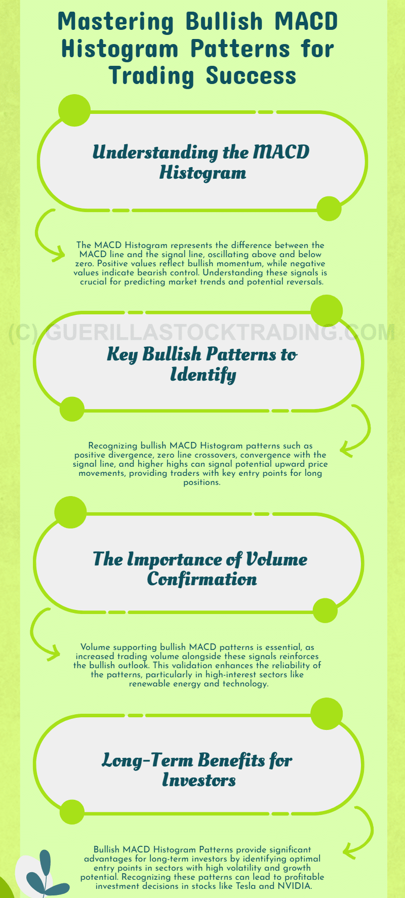
The MACDThe MACD indicator is essentially a momentum indicator that shows the relationship between two different moving averages of price. The MACD is the difference between the 12-period … Histogram is a cornerstone of technical analysis in trading and investing. Representing the difference between the MACDThe MACD indicator is essentially a momentum indicator that shows the relationship between two different moving averages of price. The MACD is the difference between the 12-period … line and the signal line, this indicator oscillates above and below a central zero line, offering valuable insights into market momentum. Among its many applications, identifying Bullish MACDThe MACD indicator is essentially a momentum indicator that shows the relationship between two different moving averages of price. The MACD is the difference between the 12-period … Histogram Patterns stands out as a critical skill for traders and investors seeking to capitalize on upward price movements.
The Basics of the MACD Histogram
Before delving into bullish patterns, it’s essential to understand the MACDThe MACD indicator is essentially a momentum indicator that shows the relationship between two different moving averages of price. The MACD is the difference between the 12-period … Histogram itself. Derived from the MACDThe MACD indicator is essentially a momentum indicator that shows the relationship between two different moving averages of price. The MACD is the difference between the 12-period … line and signal line, the histogram visually represents the difference between the two.
- Positive values suggest bullish momentum, indicating buyers are gaining control.
- Negative values reflect bearish momentum, signaling sellers’ dominance.
By interpreting these oscillations, traders can glean insights into market trends and potential reversals.
What Are Bullish MACD Histogram Patterns?
Bullish MACDThe MACD indicator is essentially a momentum indicator that shows the relationship between two different moving averages of price. The MACD is the difference between the 12-period … Histogram Patterns signal potential upward price movements, making them vital for traders looking to enter long positions. These patterns occur when specific characteristics emerge in the histogram, highlighting shifts in momentum from bearish to bullish.
Why It Matters for Investors
For investors, especially those focused on growth stocks or sectors with high volatility, recognizing bullish patterns can inform decisions about entry points. Companies like Tesla or NVIDIA, known for significant price swings, often exhibit such patterns. Understanding these signals can help investors align their strategies with market sentiment, maximizing returns.
Key Bullish MACD Histogram Patterns
Positive Divergence
One of the most telling patterns, positive divergence, occurs when the price of an asset forms lower lows while the MACDThe MACD indicator is essentially a momentum indicator that shows the relationship between two different moving averages of price. The MACD is the difference between the 12-period … Histogram creates higher lows.
- Interpretation: This indicates weakening bearish momentum, often signaling a bullish reversal.
- Example: Consider a tech stock experiencing a price dip. If the MACDThe MACD indicator is essentially a momentum indicator that shows the relationship between two different moving averages of price. The MACD is the difference between the 12-period … Histogram shows higher bars despite the price decline, it suggests a potential upward move.
For companies like Apple, whose stock often reacts to market sentiment and earnings expectations, positive divergence can provide early clues to a price recovery.
Zero Line Crossover
A zero line crossover happens when the MACDThe MACD indicator is essentially a momentum indicator that shows the relationship between two different moving averages of price. The MACD is the difference between the 12-period … Histogram transitions from negative to positive values.
- Interpretation: This shift indicates a change from bearish to bullish momentum.
- Trading Implication: Traders often view this as confirmation of an emerging uptrend, making it an ideal entry point.
For investors in cyclical industries such as energy, where stocks like ExxonMobil respond to commodity prices, this pattern can signal a favorable time to enter the market.
Convergence with the Signal Line
When the MACDThe MACD indicator is essentially a momentum indicator that shows the relationship between two different moving averages of price. The MACD is the difference between the 12-period … Histogram converges with and crosses above the signal line, it marks another bullish indicator.
- Interpretation: This suggests that bullish momentum is strengthening.
- Example: In high-growth sectors like semiconductors, companies such as AMD often see these patterns preceding a price rally, driven by positive news or increased demand.
Higher Highs in the Histogram
The formation of higher highs in the MACDThe MACD indicator is essentially a momentum indicator that shows the relationship between two different moving averages of price. The MACD is the difference between the 12-period … Histogram is a strong indicator of accelerating bullish momentum.
- Interpretation: Higher peaks suggest growing market enthusiasm and the likelihood of sustained upward price movement.
- Use Case: For volatile stocks like those in the biotechnology sector, such as Moderna, higher highs often coincide with breakthroughs or favorable regulatory updates.
Volume Confirmation
Volume plays a crucial role in validating Bullish MACDThe MACD indicator is essentially a momentum indicator that shows the relationship between two different moving averages of price. The MACD is the difference between the 12-period … Histogram Patterns.
- Interpretation: An increase in trading volume alongside these patterns reinforces the bullish signal.
- Example: Stocks in sectors like renewable energy, where market sentiment drives trading, often exhibit this combination, making patterns more reliable.
Practical Example: Spotting Bullish Patterns
Imagine a stock in the technology sector experiencing a downtrend. The MACDThe MACD indicator is essentially a momentum indicator that shows the relationship between two different moving averages of price. The MACD is the difference between the 12-period … Histogram begins forming higher lows, indicating positive divergence. At the same time, trading volume rises, and the histogram crosses the zero line.
- Result: These factors collectively suggest a bullish reversal. Traders who recognize this pattern might enter a long position, benefiting from the upward trend.
Why These Patterns Are Essential for Investors
Bullish MACDThe MACD indicator is essentially a momentum indicator that shows the relationship between two different moving averages of price. The MACD is the difference between the 12-period … Histogram Patterns are not exclusive to short-term traders. Long-term investors can also benefit by identifying key entry points for high-growth stocks or cyclical industries. For instance:
- NVIDIA: As a leader in AI and GPUs, its stock often reflects market optimism. Recognizing bullish patterns can help investors capitalize on price momentum during product launches or earnings seasons.
- Tesla: Known for volatility, Tesla’s stock price frequently aligns with technical indicators like the MACDThe MACD indicator is essentially a momentum indicator that shows the relationship between two different moving averages of price. The MACD is the difference between the 12-period … Histogram, making it a critical case for bullish pattern analysis.
- Energy Stocks: Companies like Chevron and ExxonMobil, influenced by oil price trends, often exhibit these patterns, offering investors insights into market cycles.
Bullish MACDThe MACD indicator is essentially a momentum indicator that shows the relationship between two different moving averages of price. The MACD is the difference between the 12-period … Histogram Patterns are a vital tool in the arsenal of traders and investors. By identifying positive divergence, zero line crossovers, signal line convergence, and higher highs, market participants can better understand shifts in momentum and anticipate upward price movements. When combined with volume analysis and a broader market perspective, these patterns become even more reliable.
For investors, the ability to interpret these patterns can unlock opportunities in volatile stocks and cyclical sectors, providing a competitive edge in dynamic markets. Incorporating MACDThe MACD indicator is essentially a momentum indicator that shows the relationship between two different moving averages of price. The MACD is the difference between the 12-period … Histogram analysis into trading strategies is not just beneficial — it’s essential for success in today’s fast-paced financial landscape.
Decoding Bearish MACD Histogram Patterns
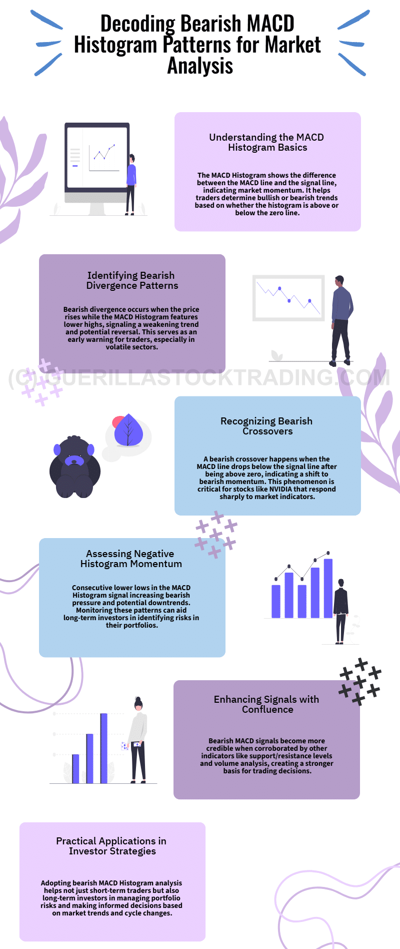
The MACDThe MACD indicator is essentially a momentum indicator that shows the relationship between two different moving averages of price. The MACD is the difference between the 12-period … Histogram is a powerful tool within the MACDThe MACD indicator is essentially a momentum indicator that shows the relationship between two different moving averages of price. The MACD is the difference between the 12-period … indicator suite, offering traders and investors insights into market momentum and potential trend reversals. While often used to identify bullish opportunities, the histogram also plays a crucial role in spotting bearish market conditions. Understanding bearish MACDThe MACD indicator is essentially a momentum indicator that shows the relationship between two different moving averages of price. The MACD is the difference between the 12-period … histogram patterns can help traders anticipate downtrends and make informed decisions.
The Foundation: Understanding the MACD Histogram
To comprehend bearish MACDThe MACD indicator is essentially a momentum indicator that shows the relationship between two different moving averages of price. The MACD is the difference between the 12-period … histogram patterns, it’s essential to first understand how the MACDThe MACD indicator is essentially a momentum indicator that shows the relationship between two different moving averages of price. The MACD is the difference between the 12-period … Histogram works.
- What Is It?
The MACDThe MACD indicator is essentially a momentum indicator that shows the relationship between two different moving averages of price. The MACD is the difference between the 12-period … Histogram represents the difference between the MACDThe MACD indicator is essentially a momentum indicator that shows the relationship between two different moving averages of price. The MACD is the difference between the 12-period … line (short-term moving averageThe concept of moving averages dates back to the early 20th century. While it is challenging to attribute the invention of moving averages to a single individual, W. P. Hamilton, a…) and the signal line (long-term moving averageThe concept of moving averages dates back to the early 20th century. While it is challenging to attribute the invention of moving averages to a single individual, W. P. Hamilton, a…). - Bullish vs. Bearish Momentum
When the histogram is above the zero line, it reflects bullish momentum. When it falls below the zero line, it signals bearish momentum. The length and height of the bars indicate the strength of the trend.
For investors, particularly those focused on companies with high volatility, such as Tesla or AMD, interpreting the MACDThe MACD indicator is essentially a momentum indicator that shows the relationship between two different moving averages of price. The MACD is the difference between the 12-period … Histogram can provide actionable insights into market sentiment.
Key Bearish MACD Histogram Patterns
Divergence Patterns
Bearish divergence is a significant pattern where the price of an asset moves higher while the MACDThe MACD indicator is essentially a momentum indicator that shows the relationship between two different moving averages of price. The MACD is the difference between the 12-period … Histogram forms lower highs.
- What It Means: This disparity suggests weakening upward momentum, often preceding a bearish reversal.
- Example: Consider a scenario where Tesla’s stock price reaches new highs, but the MACDThe MACD indicator is essentially a momentum indicator that shows the relationship between two different moving averages of price. The MACD is the difference between the 12-period … Histogram consistently forms lower peaks. This pattern warns of waning momentum and a possible downturn.
For companies in tech or growth sectors, where price movements can be rapid and substantial, bearish divergence acts as an early alert for potential trend changes.
Bearish Crossovers
A bearish crossover occurs when the MACDThe MACD indicator is essentially a momentum indicator that shows the relationship between two different moving averages of price. The MACD is the difference between the 12-period … line crosses below the signal line after both are positioned above the zero line.
- What It Means: This event signals a transition from bullish to bearish momentum. The MACDThe MACD indicator is essentially a momentum indicator that shows the relationship between two different moving averages of price. The MACD is the difference between the 12-period … Histogram visually confirms this with bars moving from positive to negative territory.
- Why It Matters: For stocks like NVIDIA, which often react to news or earnings reports, bearish crossovers can signal when a previously bullish trend is reversing.
Negative Histogram Momentum
The MACDThe MACD indicator is essentially a momentum indicator that shows the relationship between two different moving averages of price. The MACD is the difference between the 12-period … Histogram’s momentum provides vital clues about the strength of bearish trends.
- What to Look For: Consecutive bars below the zero line, each forming lower lows, indicate intensifying bearish pressure.
- Example: Imagine a scenario where Apple Inc. (AAPL) shows a series of deepening negative histogram bars while its price consolidates. This pattern can suggest a prolonged downtrend.
For long-term investors, such as those holding stocks in industries like energy or financials, monitoring histogram momentum can help gauge market sentiment and potential risk.
Confluence with Other Indicators
The MACDThe MACD indicator is essentially a momentum indicator that shows the relationship between two different moving averages of price. The MACD is the difference between the 12-period … Histogram’s bearish signals become more reliable when combined with other technical indicators.
- Support and Resistance Levels: A bearish MACDThe MACD indicator is essentially a momentum indicator that shows the relationship between two different moving averages of price. The MACD is the difference between the 12-period … Histogram pattern that aligns with a price hitting strong resistance offers a robust reversal signal.
- Volume Analysis: Increased trading volume during bearish patterns strengthens their reliability.
- Example: In the case of ExxonMobil, if the MACDThe MACD indicator is essentially a momentum indicator that shows the relationship between two different moving averages of price. The MACD is the difference between the 12-period … Histogram dips below zero while the stock faces resistance at a significant price level, it may confirm a bearish reversal.
Case Study: Bearish MACD Histogram Pattern in Nvidia (NVDA)
To illustrate the real-world application of these patterns, consider Nvidia (NVDA):
- The Setup: NVDA’s stock price reaches new peaks while the MACDThe MACD indicator is essentially a momentum indicator that shows the relationship between two different moving averages of price. The MACD is the difference between the 12-period … Histogram forms lower highs, signaling a bearish divergence.
- The Confirmation: The MACDThe MACD indicator is essentially a momentum indicator that shows the relationship between two different moving averages of price. The MACD is the difference between the 12-period … line crosses below the signal line, creating a bearish crossover.
- The Action: Traders interpret this as a sell signal, allowing them to reduce exposure or short the stock before a downtrend begins.
This case study highlights the importance of recognizing bearish MACDThe MACD indicator is essentially a momentum indicator that shows the relationship between two different moving averages of price. The MACD is the difference between the 12-period … Histogram patterns as a tool for managing risk in high-value stocks.
Why These Patterns Matter for Investors
Bearish MACDThe MACD indicator is essentially a momentum indicator that shows the relationship between two different moving averages of price. The MACD is the difference between the 12-period … Histogram patterns are not just for short-term traders. Long-term investors can use them to identify periods of potential weakness in their portfolio holdings.
- Apple Inc. (AAPL): As a market leader, AAPL’s price trends influence broader indices. Recognizing bearish patterns can help investors manage exposure.
- NVIDIA (NVDA): In the semiconductor space, bearish patterns may signal shifts in demand or market sentiment.
- Energy Companies: For stocks like ExxonMobil, bearish patterns often align with macroeconomic shifts, such as changes in oil prices.
Understanding these signals enables investors to make proactive decisions, avoiding potential losses during downturns.
Bearish MACDThe MACD indicator is essentially a momentum indicator that shows the relationship between two different moving averages of price. The MACD is the difference between the 12-period … Histogram patterns are invaluable tools for identifying potential reversals and market shifts. Patterns like divergences, bearish crossovers, and negative momentum offer early warning signs of bearish trends. By combining these signals with other technical indicators, traders and investors can improve the accuracy of their strategies.
Chart patternsChart patterns are visual formations on price charts that occur due to the behavior of buyers and sellers in the market. These patterns often signal potential future price movement… are powerful graphical tools that represent an asset’s price movement over time, enabling traders and investors to anticipate potential trends and identify trading opportunities. However, not all chart patternsChart patterns are visual formations on price charts that occur due to the behavior of buyers and sellers in the market. These patterns often signal potential future price movement… are straightforward or reliable, making it essential to use additional tools and techniques to enhance their effectiveness.
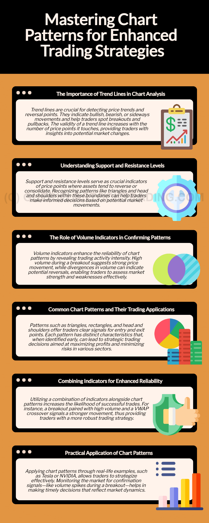
The Role of Trend Lines in Identifying Chart Patterns
Trend lines are foundational to technical analysis. They connect significant highs or lows in price movements, revealing trends and potential reversal points.
Drawing and Analyzing Trend Lines
Trend lines can be upward (bullish), downward (bearish), or horizontal (neutral). The more points a trend line touches, the more valid it becomes.
- Breakouts: Occur when the price breaks above or below a trend line, signaling a change in trend direction. A breakoutBreakout patterns occur when a stock price moves beyond a defined level of support or resistance with increased volume, signaling the potential start of a new trend. A breakout ind… accompanied by high volume is particularly significant. For instance, if a stock like Apple (AAPL) breaks above a downward trend line with surging volume, it may indicate the start of a bullish reversal.
- Pullbacks: After a breakoutBreakout patterns occur when a stock price moves beyond a defined level of support or resistance with increased volume, signaling the potential start of a new trend. A breakout ind…, prices may retrace to test the trend line as a new support or resistance level. A pullback followed by a continuation of the breakoutBreakout patterns occur when a stock price moves beyond a defined level of support or resistance with increased volume, signaling the potential start of a new trend. A breakout ind… trend confirms its validity.
- Channels: Defined by two parallel trend lines, channels indicate ranges of support and resistance. Traders can capitalize on these oscillations or await breakouts to identify new trends.
Why Trend Lines Matter for Investors
For companies like Tesla (TSLA), known for high volatility, trend lines help investors identify critical breakoutBreakout patterns occur when a stock price moves beyond a defined level of support or resistance with increased volume, signaling the potential start of a new trend. A breakout ind… or reversal points. Recognizing these patterns early can optimize entry and exit strategies.
Support and Resistance Levels: Defining Boundaries
Support and resistance levels are horizontal lines indicating where prices tend to bounce or reverse.
Identifying Chart Patterns with Support and Resistance
- Triangles: These form when two converging trend lines create a triangular shape, signaling consolidation before a breakoutBreakout patterns occur when a stock price moves beyond a defined level of support or resistance with increased volume, signaling the potential start of a new trend. A breakout ind… or breakdown. For example, Amazon (AMZN) stock often exhibits triangle patterns before earnings announcements, offering cues for price movements.
- Rectangles: Horizontal trend lines create rectangular patterns during periods of consolidation. Breakouts or breakdowns from these rectangles indicate trend continuation or reversal.
- Head and ShouldersThe head and shoulders chart pattern is a technical analysis tool used in stock trading. It is one of the most well-known and widely recognized chart patterns, and it is used by in…: This bearish reversal pattern consists of three peaks, with the middle peak (the head) being the highest. A breakdown below the neckline signifies the start of a downtrend, commonly seen in high-growth sectors like technology.
Why Support and Resistance Levels Matter
Understanding support and resistance is vital for industries sensitive to macroeconomic conditions, such as ExxonMobil (XOM) in energy markets. These levels help investors identify potential turning points amid price fluctuations.
Volume Indicators: Confirming Chart Patterns
Volume indicators reveal the intensity of trading activity, enhancing the reliability of chart patternsChart patterns are visual formations on price charts that occur due to the behavior of buyers and sellers in the market. These patterns often signal potential future price movement….
Key Volume Indicators
- Volume Bars: High volume bars indicate strong price movements or significant market events. A breakoutBreakout patterns occur when a stock price moves beyond a defined level of support or resistance with increased volume, signaling the potential start of a new trend. A breakout ind… from a pattern with high volume suggests greater reliability.
- Volume Spikes: Significant surges in trading volume often accompany breakouts or breakdowns, validating the movement.
- On-Balance VolumeThe On Balance Volume indicator (OBV) is a technical analysis tool used to measure the flow of money into and out of a security over a specified period of time. It is a cumulative … (OBVThe On Balance Volume indicator (OBV) is a technical analysis tool used to measure the flow of money into and out of a security over a specified period of time. It is a cumulative …): OBVThe On Balance Volume indicator (OBV) is a technical analysis tool used to measure the flow of money into and out of a security over a specified period of time. It is a cumulative … tracks cumulative buying or selling pressure. Divergences between OBVThe On Balance Volume indicator (OBV) is a technical analysis tool used to measure the flow of money into and out of a security over a specified period of time. It is a cumulative … and price trends often signal potential reversals. For example, if Microsoft (MSFT) shows higher highs in price but declining OBVThe On Balance Volume indicator (OBV) is a technical analysis tool used to measure the flow of money into and out of a security over a specified period of time. It is a cumulative …, it may warn of weakening bullish momentum.
- Volume-Weighted Average Price (VWAP): This dynamic support or resistance level helps traders identify fair value over a specific period. A VWAP crossover can signal trend changes or confirm breakouts.
Why Volume Indicators Matter
For companies like NVIDIA (NVDA), whose stock responds strongly to earnings reports or technological innovations, volume indicators confirm whether the market supports price movements.
Common Chart Patterns and Their Applications
Triangles
Triangles (symmetrical, ascending, descending) reflect periods of consolidation. As the triangle narrows, the likelihood of a breakoutBreakout patterns occur when a stock price moves beyond a defined level of support or resistance with increased volume, signaling the potential start of a new trend. A breakout ind… increases.
- Trading Triangles: Measure the height of the triangle at its widest point to estimate the target price after a breakoutBreakout patterns occur when a stock price moves beyond a defined level of support or resistance with increased volume, signaling the potential start of a new trend. A breakout ind…. For example, Meta (META) stocks often exhibit symmetrical triangles before major announcements, helping traders prepare for price movements.
Rectangles
Rectangles signify consolidation between two horizontal levels.
- Trading Rectangles: Look for breakouts or breakdowns to determine the trend’s next direction. AAPL stocks, for instance, often trade within rectangles during calm market periods before breaking out into significant trends.
Head and Shoulders
This bearish reversal pattern signals the end of an uptrend.
- Trading Head and ShouldersThe head and shoulders chart pattern is a technical analysis tool used in stock trading. It is one of the most well-known and widely recognized chart patterns, and it is used by in…: Measure the distance from the head to the neckline to estimate the target price after a breakdown. For investors in tech companies like AMD, spotting this pattern early can mitigate risks during market corrections.
Combining Tools for Better Results
Confluence with Other Indicators
Using multiple indicators alongside chart patternsChart patterns are visual formations on price charts that occur due to the behavior of buyers and sellers in the market. These patterns often signal potential future price movement… increases reliability. For example:
- A triangle breakoutBreakout patterns occur when a stock price moves beyond a defined level of support or resistance with increased volume, signaling the potential start of a new trend. A breakout ind… accompanied by a VWAP crossover and high volume is more likely to result in a sustained price movement.
- A bearish divergence between OBVThe On Balance Volume indicator (OBV) is a technical analysis tool used to measure the flow of money into and out of a security over a specified period of time. It is a cumulative … and price trends within a head and shouldersThe head and shoulders chart pattern is a technical analysis tool used in stock trading. It is one of the most well-known and widely recognized chart patterns, and it is used by in… pattern strengthens the sell signal.
Practical Example
Consider Tesla (TSLA) stock forming a triangle pattern:
- The triangle narrows as prices approach a breakoutBreakout patterns occur when a stock price moves beyond a defined level of support or resistance with increased volume, signaling the potential start of a new trend. A breakout ind… point.
- Volume decreases within the triangle but spikes during the breakoutBreakout patterns occur when a stock price moves beyond a defined level of support or resistance with increased volume, signaling the potential start of a new trend. A breakout ind….
- The breakoutBreakout patterns occur when a stock price moves beyond a defined level of support or resistance with increased volume, signaling the potential start of a new trend. A breakout ind… aligns with a VWAP crossover.
This confluence of signals confirms the pattern, allowing traders to enter positions with greater confidence.
Why These Tools and Patterns Matter
Chart patternsChart patterns are visual formations on price charts that occur due to the behavior of buyers and sellers in the market. These patterns often signal potential future price movement…, supported by tools like trend lines, volume indicators, and support and resistance levels, provide a comprehensive framework for technical analysis.
- Technology Stocks: Patterns like triangles and rectangles in tech giants like NVIDIA and AMD can signal key entry points during periods of rapid innovation.
- Energy Stocks: For ExxonMobil, volume indicators validate movements driven by macroeconomic shifts, helping investors navigate volatile markets.
- Consumer Stocks: Companies like Procter & Gamble (PG) often exhibit head and shouldersThe head and shoulders chart pattern is a technical analysis tool used in stock trading. It is one of the most well-known and widely recognized chart patterns, and it is used by in… patterns during market corrections, guiding investors on risk management.
Chart patternsChart patterns are visual formations on price charts that occur due to the behavior of buyers and sellers in the market. These patterns often signal potential future price movement…, combined with robust analytical tools, are invaluable for traders and investors aiming to understand market trends and optimize their strategies. By leveraging trend lines, support and resistance levels, and volume indicators, market participants can identify opportunities with higher accuracy.
Whether investing in high-growth tech stocks, navigating cyclical energy markets, or managing portfolios during volatile periods, mastering these techniques ensures a well-rounded approach to technical analysis.
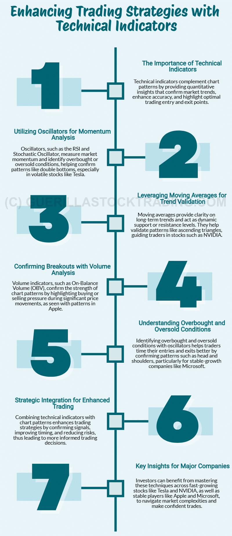
Enhancing Chart Pattern Analysis with Technical Indicators
Chart patternsChart patterns are visual formations on price charts that occur due to the behavior of buyers and sellers in the market. These patterns often signal potential future price movement… are a cornerstone of technical analysis, helping traders and investors identify potential market movements. However, their effectiveness increases significantly when combined with technical indicators. These indicators provide critical insights into market trends, validate patterns, and predict price changes.
The Role of Technical Indicators in Chart Pattern Analysis
Technical indicators offer a quantitative perspective on market dynamics. When paired with chart patternsChart patterns are visual formations on price charts that occur due to the behavior of buyers and sellers in the market. These patterns often signal potential future price movement…, they provide confirmation, improve accuracy, and highlight optimal entry and exit points. Let’s explore the most effective ways to integrate these tools.
Confirmation Through Oscillators
Oscillators are invaluable for measuring momentum and identifying overbought or oversold conditions.
- How They Work: Oscillators like the Relative Strength IndexIn the world of technical analysis, the Relative Strength Index (RSI) stands as a cornerstone tool for traders seeking insights into market momentum. Developed by J. Welles Wilder … (RSIIn the world of technical analysis, the Relative Strength Index (RSI) stands as a cornerstone tool for traders seeking insights into market momentum. Developed by J. Welles Wilder …) and Stochastic Oscillator quantify the strength of a price movement and its potential for reversal.
- Example: If a bullish double bottomThe double bottom chart pattern is a reversal pattern that indicates the exhaustion of a downward trend and the potential for an upward trend. chart patternChart patterns are visual formations on price charts that occur due to the behavior of buyers and sellers in the market. These patterns often signal potential future price movement… is identified, the RSIIn the world of technical analysis, the Relative Strength Index (RSI) stands as a cornerstone tool for traders seeking insights into market momentum. Developed by J. Welles Wilder … can confirm if the stock is oversold and ready to reverse. For instance, in stocks like Tesla (TSLA), where price movements are often extreme, an oscillator confirming oversold conditions alongside a double bottomThe double bottom chart pattern is a reversal pattern that indicates the exhaustion of a downward trend and the potential for an upward trend. pattern could signal a high-probability buying opportunity.
For volatile growth stocks like Tesla, oscillators help reduce uncertainty, offering traders the confidence to act on pattern signals.
Trend Confirmation with Moving Averages
Moving averagesThe concept of moving averages dates back to the early 20th century. While it is challenging to attribute the invention of moving averages to a single individual, W. P. Hamilton, a… smooth out price data, providing clarity on long-term trends and dynamic support or resistance levels.
- How They Work: Moving averagesThe concept of moving averages dates back to the early 20th century. While it is challenging to attribute the invention of moving averages to a single individual, W. P. Hamilton, a…, such as the 50-day or 200-day, can confirm the direction and strength of a trend.
- Example: In a bullish ascending triangleAn ascending triangle chart pattern is a chart pattern used in technical analysis that is characterized by a flat upper trend line… pattern, a rising 50-day moving averageThe concept of moving averages dates back to the early 20th century. While it is challenging to attribute the invention of moving averages to a single individual, W. P. Hamilton, a… supports the likelihood of an upward breakoutBreakout patterns occur when a stock price moves beyond a defined level of support or resistance with increased volume, signaling the potential start of a new trend. A breakout ind…. Investors in companies like NVIDIA (NVDA), a leader in AI-driven growth, can use moving averagesThe concept of moving averages dates back to the early 20th century. While it is challenging to attribute the invention of moving averages to a single individual, W. P. Hamilton, a… to validate long-term upward trends indicated by chart patternsChart patterns are visual formations on price charts that occur due to the behavior of buyers and sellers in the market. These patterns often signal potential future price movement….
For companies like NVIDIA, moving averagesThe concept of moving averages dates back to the early 20th century. While it is challenging to attribute the invention of moving averages to a single individual, W. P. Hamilton, a… not only confirm patterns but also highlight areas where traders can enter or exit positions with reduced risk.
Volume Confirmation
Volume trends are crucial in determining the validity of chart patternsChart patterns are visual formations on price charts that occur due to the behavior of buyers and sellers in the market. These patterns often signal potential future price movement….
- How It Works: Indicators like On-Balance VolumeThe On Balance Volume indicator (OBV) is a technical analysis tool used to measure the flow of money into and out of a security over a specified period of time. It is a cumulative … (OBVThe On Balance Volume indicator (OBV) is a technical analysis tool used to measure the flow of money into and out of a security over a specified period of time. It is a cumulative …) and volume spikes highlight buying or selling pressure.
- Example: If a cup and handleThe cup and handle chart pattern is a widely recognized formation in technical analysis that signals potential bullish price movements. Initially introduced by William J. O’Neil in… pattern forms in a stock like Apple (AAPL), a volume surge during the breakoutBreakout patterns occur when a stock price moves beyond a defined level of support or resistance with increased volume, signaling the potential start of a new trend. A breakout ind… above the handle’s resistance level confirms the pattern’s strength. Traders can use OBVThe On Balance Volume indicator (OBV) is a technical analysis tool used to measure the flow of money into and out of a security over a specified period of time. It is a cumulative … to ensure the breakoutBreakout patterns occur when a stock price moves beyond a defined level of support or resistance with increased volume, signaling the potential start of a new trend. A breakout ind… is supported by increased buying pressure.
Volume analysis helps investors in large-cap stocks like Apple, where institutional buying or selling often drives significant price changes, confirm pattern reliability and avoid false breakouts.
Identifying Overbought and Oversold Conditions
Overbought and oversold signals often precede trend reversals, making them essential for timing trades.
- How It Works: Oscillators like the Stochastic Oscillator identify overbought and oversold zones, providing critical confirmation signals.
- Example: If a bearish head and shouldersThe head and shoulders chart pattern is a technical analysis tool used in stock trading. It is one of the most well-known and widely recognized chart patterns, and it is used by in… pattern appears in a stock like Microsoft (MSFT), an overbought condition indicated by the Stochastic Oscillator strengthens the case for a short position. Waiting for the oscillator to cross below its overbought line further increases trade reliability.
For stable-growth companies like Microsoft, which attract both traders and long-term investors, using overbought or oversold signals ensures better timing and risk management.
Practical Benefits of Combining Technical Indicators and Chart Patterns
Integrating technical indicators with chart patternsChart patterns are visual formations on price charts that occur due to the behavior of buyers and sellers in the market. These patterns often signal potential future price movement… enhances trading strategies by:
- Confirming Signals: Indicators reduce the likelihood of false breakouts or breakdowns, ensuring patterns align with broader market conditions.
- Improving Timing: Tools like oscillators and moving averagesThe concept of moving averages dates back to the early 20th century. While it is challenging to attribute the invention of moving averages to a single individual, W. P. Hamilton, a… highlight optimal entry and exit points, increasing profitability.
- Reducing Risk: By adding an extra layer of validation, traders can approach trades with greater confidence and manage losses effectively.
Technical indicators are especially valuable for investors focusing on major companies that experience significant market attention:
- Tesla (TSLA): High volatility requires precise timing, and tools like RSIIn the world of technical analysis, the Relative Strength Index (RSI) stands as a cornerstone tool for traders seeking insights into market momentum. Developed by J. Welles Wilder … and volume indicators help traders act confidently during sharp price movements.
- NVIDIA (NVDA): With its dominance in AI and semiconductors, moving averagesThe concept of moving averages dates back to the early 20th century. While it is challenging to attribute the invention of moving averages to a single individual, W. P. Hamilton, a… confirm long-term trends, enabling investors to capitalize on its growth trajectory.
- Apple (AAPL): A market leader, Apple’s stock patterns often align with volume trends, making indicators like OBVThe On Balance Volume indicator (OBV) is a technical analysis tool used to measure the flow of money into and out of a security over a specified period of time. It is a cumulative … critical for identifying reliable breakouts.
- Microsoft (MSFT): Known for its stability, oscillators help identify short-term overbought or oversold conditions within broader bullish or bearish trends.
Combining technical indicators with chart patternsChart patterns are visual formations on price charts that occur due to the behavior of buyers and sellers in the market. These patterns often signal potential future price movement… elevates trading strategies, providing traders with a comprehensive view of market dynamics. Whether confirming trends with moving averagesThe concept of moving averages dates back to the early 20th century. While it is challenging to attribute the invention of moving averages to a single individual, W. P. Hamilton, a…, validating breakouts with volume indicators, or identifying reversals with oscillators, these tools ensure that chart patternsChart patterns are visual formations on price charts that occur due to the behavior of buyers and sellers in the market. These patterns often signal potential future price movement… are supported by quantitative evidence.
For investors focusing on companies like Tesla, NVIDIA, Apple, and Microsoft, mastering the integration of indicators and patterns can unlock better opportunities in both volatile and stable markets. By enhancing analysis with technical indicators, traders and investors can navigate the complexities of the market with increased accuracy and confidence.
Understanding the Psychology of Chart Patterns: A Key to Smarter Investing
Chart patternsChart patterns are visual formations on price charts that occur due to the behavior of buyers and sellers in the market. These patterns often signal potential future price movement… are more than just graphical representations of price movements; they offer deep insights into human psychology and market behavior. Among the many patterns traders rely on, the Head and ShouldersThe head and shoulders chart pattern is a technical analysis tool used in stock trading. It is one of the most well-known and widely recognized chart patterns, and it is used by in… Top pattern stands out for its ability to signal a potential reversal from an uptrend to a downtrend. This blog explores the psychological underpinnings of this pattern and why understanding it is critical for investors looking to navigate market sentiment effectively.
The Head and Shoulders Top Pattern Psychology
The Head and ShouldersThe head and shoulders chart pattern is a technical analysis tool used in stock trading. It is one of the most well-known and widely recognized chart patterns, and it is used by in… Top pattern is a classic technical formation that signifies a shift in market sentiment. Each phase of the pattern reflects collective trader behavior and emotions as the market transitions from bullish enthusiasm to bearish caution.
Left Shoulder: The Initial Bullish Push
The formation begins with a price rally that aligns with the prevailing uptrend. During this phase, optimism dominates as traders expect the upward momentum to continue. However, as the price reaches its first peak, selling pressure starts to build, leading to a slight decline.
This phase reflects early signs of market hesitation. While buyers remain largely confident, the appearance of profit-takers suggests that not all participants believe the trend will last.
Head: Bullish Resurgence with a Hidden Warning
The second phase is marked by a renewed price surge that surpasses the first peak, forming the “head.” This higher high temporarily reinforces the belief that the uptrend is strong and sustainable, prompting more aggressive buying.
However, this rally is met with stronger selling pressure, leading to a sharper decline. This phase highlights the false sense of security among traders, as increasing resistance begins to undermine confidence. While some remain bullish, others start to question the sustainability of the trend.
Right Shoulder: Fading Momentum
The right shoulder forms when the price attempts another rally but fails to reach the high of the head, creating a lower peak. This lower high reflects a waning of bullish momentum and growing skepticism among traders.
During this stage, buyers grow hesitant, and sellers become more assertive. The inability to achieve a new high signals that the market strength is fading, and a bearish sentiment begins to take hold.
Neckline Break: The Turning Point
The pattern completes when the price breaks below the “neckline,” a line connecting the lows of the left shoulder and the head. This break is a critical signal, confirming the bearish reversal and often triggering accelerated selling activity.
At this point, market sentiment shifts decisively. Traders interpret the neckline break as a confirmation of the downtrend, leading to a surge in selling pressure as long positions are liquidated and short positions are initiated.
Key Psychological Themes in the Pattern
Euphoria and Optimism
The initial rally and the formation of the head are driven by bullish confidence and optimism. Traders expect the uptrend to persist, often leading to overconfidence and aggressive buying.
Skepticism and Unease
As the right shoulder forms, skepticism grows. The lower high reflects waning bullish momentum, and hesitation begins to dominate. This phase marks the transition from optimism to caution as traders reevaluate their positions.
Capitulation
The break below the neckline is a moment of capitulation. Fear takes over as traders rush to exit long positions and initiate shorts, driving the market into a downtrend. This phase underscores the power of collective sentiment in dictating market movements.
Understanding the Psychology Behind the Double Top Pattern
The Double TopThe double top chart patterns occur when the price of a security makes two successive highs, with a valley in between, before the price begins to decline again. pattern is a prominent chart formation in technical analysis that signals a potential reversal from an uptrend to a downtrend. This pattern reflects the collective psychology of market participants, particularly their hesitation and eventual loss of confidence in sustaining an upward trend. Here’s a breakdown of the psychological dynamics driving the Double TopThe double top chart patterns occur when the price of a security makes two successive highs, with a valley in between, before the price begins to decline again. pattern.
The First Peak: Initial Optimism Meets Resistance
During the formation of the first peak, buyers dominate the market, pushing prices higher with confidence. Optimism is high as traders anticipate the continuation of the uptrend. However, when the price reaches a certain level, significant selling pressure emerges, creating resistance and halting the upward momentum. This resistance leads to a price decline. At this stage, the market sentiment is still largely bullish, with traders viewing the pullback as a temporary retracement rather than a trend reversal.
The Second Peak: Testing the Highs with Waning Confidence
Following the dip, the price recovers and attempts to retest the previous high. During this phase, buyers try to reassert control, but the momentum is noticeably weaker compared to the first peak. Once again, the price encounters strong resistance, failing to break through the previous high. This repeated failure raises doubts among traders about the strength of the trend. Many begin to question the sustainability of the uptrend, and skepticism starts to replace optimism.
Decline After the Second Peak: Bearish Sentiment Gains Momentum
After failing to surpass the resistance level for the second time, market sentiment shifts. Buyers begin to lose confidence, and sellers gain the upper hand, leading to a sharper decline in price. The inability to reach new highs solidifies the growing bearish sentiment. Traders who were previously optimistic start exiting their positions, adding to the downward pressure.
Neckline Break: Confirmation of a Downtrend
The pattern is confirmed when the price breaks below the “neckline,” a support level that connects the lows of the retracements between the two peaks. This break serves as a strong bearish signal. The confirmation of the neckline break often triggers fear among traders, leading to an acceleration in selling activity. Long positions are liquidated, and short positions are initiated, pushing prices further downward. At this stage, bearish sentiment dominates the market, and traders accept that the trend has reversed.
Key Psychological Themes in the Double Top Pattern
The Double TopThe double top chart patterns occur when the price of a security makes two successive highs, with a valley in between, before the price begins to decline again. pattern reflects several psychological themes. Initially, the market is driven by overconfidence and euphoria as traders expect the uptrend to continue. The first peak marks the height of this bullish sentiment. As the second peak forms, skepticism sets in, and traders become hesitant. The lower momentum at this stage highlights a growing doubt about the trend’s sustainability. Finally, the neckline break signifies fear and capitulation as traders rush to exit long positions, cementing the bearish trend.
The Psychology Behind the Double Bottom Pattern
The Double BottomThe double bottom chart pattern is a reversal pattern that indicates the exhaustion of a downward trend and the potential for an upward trend. pattern is a widely recognized technical analysis formation that signals a potential reversal from a downtrend to an uptrend. It reflects the psychological transition in the market as traders and investors move from fear and despair to hope and optimism. This pattern’s strength lies in its ability to highlight key turning points in market sentiment. Below is a breakdown of the psychological dynamics that underpin the Double BottomThe double bottom chart pattern is a reversal pattern that indicates the exhaustion of a downward trend and the potential for an upward trend. pattern.
The First Trough: Fear and Capitulation
The Double BottomThe double bottom chart pattern is a reversal pattern that indicates the exhaustion of a downward trend and the potential for an upward trend. pattern begins with a pronounced downward movement, culminating in the first trough. This phase represents a period of intense selling pressure, where fear dominates the market. Traders who have been holding on to losing positions finally capitulate, driving prices lower. The sentiment is overwhelmingly bearish, with many participants believing that further declines are inevitable.
However, as the price hits a significant low, it begins to stabilize, and selling pressure eases. At this stage, some opportunistic buyers, often value investors or short-term speculators, start to enter the market, seeing the price as oversold. This leads to a minor rally, marking the end of the first trough.
The Second Trough: Testing the Lows and Building Confidence
After the initial rally, the price retraces and retests the previous low, forming the second trough. This phase is critical for gauging market sentiment. If the price holds at or near the level of the first trough without breaking significantly lower, it signals a potential floor for the asset.
The retest reflects lingering doubts among market participants. While some traders see the second trough as an opportunity to accumulate positions, others remain cautious, fearing a breakdown to new lows. This balance between buyers and sellers creates a psychological tension in the market.
The Breakout: Hope and Renewed Optimism
Once the price begins to rise from the second trough, confidence starts to build. The formation of a higher low or a breakoutBreakout patterns occur when a stock price moves beyond a defined level of support or resistance with increased volume, signaling the potential start of a new trend. A breakout ind… above the resistance level connecting the interim high between the two troughs solidifies the pattern. This breakoutBreakout patterns occur when a stock price moves beyond a defined level of support or resistance with increased volume, signaling the potential start of a new trend. A breakout ind… is interpreted as a confirmation of a trend reversal.
The psychology shifts dramatically at this point. Buyers who had been hesitant during the second trough become more aggressive, while sellers start to exit their positions, recognizing that the downtrend is over. Optimism replaces fear, and the market begins to rally.
Key Psychological Themes in the Double Bottom Pattern
- Fear and Despair: The first trough represents widespread panic and capitulation, as traders give up hope and sell their positions.
- Caution and Skepticism: The second trough reflects cautious optimism as some traders start to see value, while others remain wary of further declines.
- Hope and Optimism: The breakoutBreakout patterns occur when a stock price moves beyond a defined level of support or resistance with increased volume, signaling the potential start of a new trend. A breakout ind… above resistance signals a shift in sentiment. Traders interpret this as a sign of renewed strength, leading to increased buying activity and upward momentum.
The Psychology Behind the Ascending Triangle Pattern
The Ascending TriangleAn ascending triangle chart pattern is a chart pattern used in technical analysis that is characterized by a flat upper trend line… pattern is a bullish continuation or reversal pattern in technical analysis that reflects a gradual shift in market sentiment toward optimism and strength. This pattern forms when the price encounters a horizontal resistanceA horizontal resistance chart pattern is a type of chart which shows how price movement follows a certain pattern when price reaches a certain level. The pattern forms a resistance… level while creating a series of higher lows. The psychology behind the Ascending TriangleAn ascending triangle chart pattern is a chart pattern used in technical analysis that is characterized by a flat upper trend line… lies in the interplay between buyers and sellers and their expectations of future price movements.
Buyers’ Growing Confidence
The key characteristic of the Ascending TriangleAn ascending triangle chart pattern is a chart pattern used in technical analysis that is characterized by a flat upper trend line… is the upward trend of higher lows. This reflects growing confidence among buyers, who are willing to enter the market at progressively higher prices. Each time the price dips, buyers step in earlier than before, signaling increased demand and optimism about the asset’s future performance.
The consistent creation of higher lows indicates that sellers are losing control, as they are unable to push the price down as far as they did previously. This change in dynamics highlights the gradual strengthening of bullish sentiment in the market.
Sellers Holding the Line
The horizontal resistanceA horizontal resistance chart pattern is a type of chart which shows how price movement follows a certain pattern when price reaches a certain level. The pattern forms a resistance… line represents a level where selling pressure remains strong. Sellers repeatedly defend this price level, creating a ceiling that the price struggles to break through. This phase reflects the uncertainty in the market, as sellers attempt to maintain control while buyers challenge their dominance.
The consistent resistance also serves as a psychological barrier. Many traders perceive this level as a key point of contention, with a potential breakoutBreakout patterns occur when a stock price moves beyond a defined level of support or resistance with increased volume, signaling the potential start of a new trend. A breakout ind… above resistance signaling a significant shift in market sentiment.
The Breakout: Buyers Overpower Sellers
Eventually, the upward pressure created by the higher lows forces the price to break through the resistance level. This breakoutBreakout patterns occur when a stock price moves beyond a defined level of support or resistance with increased volume, signaling the potential start of a new trend. A breakout ind… is the culmination of buyers’ persistence and increased confidence in the asset. Once the resistance is breached, a surge of buying activity often follows as traders interpret the breakoutBreakout patterns occur when a stock price moves beyond a defined level of support or resistance with increased volume, signaling the potential start of a new trend. A breakout ind… as a confirmation of bullish momentum.
The breakoutBreakout patterns occur when a stock price moves beyond a defined level of support or resistance with increased volume, signaling the potential start of a new trend. A breakout ind… is fueled by several factors:
- Buyers’ Aggression: As the price moves higher, more traders enter the market, expecting further gains.
- Seller Capitulation: Sellers who had been defending the resistance level exit their positions, further driving the price upward.
- New Entrants: Momentum traders and investors who were waiting for confirmation join the rally, amplifying the upward move.
Key Psychological Themes in the Ascending Triangle Pattern
- Optimism and Demand: The formation of higher lows reflects growing optimism among buyers, who see the asset as increasingly valuable.
- Uncertainty and Resistance: The horizontal resistanceA horizontal resistance chart pattern is a type of chart which shows how price movement follows a certain pattern when price reaches a certain level. The pattern forms a resistance… line indicates sellers’ efforts to maintain control, creating a temporary equilibrium.
- BreakoutBreakout patterns occur when a stock price moves beyond a defined level of support or resistance with increased volume, signaling the potential start of a new trend. A breakout ind… Euphoria: Once the resistance is broken, the market experiences a surge of bullish sentiment, leading to increased buying and momentum.
The Psychology Behind the Descending Triangle Pattern
The Descending TriangleThe descending triangle pattern is a bearish continuation pattern that is formed when a series of lower highs is followed by a series of equal lows. pattern is a bearish technical formation that signals a potential continuation or reversal to the downside. It forms when the price makes a series of lower highs while encountering a strong horizontal support level. The psychology behind the Descending TriangleThe descending triangle pattern is a bearish continuation pattern that is formed when a series of lower highs is followed by a series of equal lows. reflects increasing selling pressure, diminishing buyer confidence, and a growing dominance of bearish sentiment. Below is an exploration of the psychological dynamics at play during the formation of this pattern.
Sellers’ Increasing Dominance
The defining feature of the Descending TriangleThe descending triangle pattern is a bearish continuation pattern that is formed when a series of lower highs is followed by a series of equal lows. is the series of lower highs. Each rally in price is met with more aggressive selling at progressively lower levels, which indicates that sellers are becoming increasingly confident in their ability to control the market.
This pattern reflects a gradual shift in sentiment. As the price fails to reach previous highs, traders interpret this as a sign of weakening demand. Sellers use each lower high as an opportunity to intensify their efforts, further reinforcing bearish sentiment.
Buyers Holding the Line
The horizontal support level represents a price point where buyers step in to prevent further declines. This creates a temporary floor, reflecting their efforts to maintain control and stabilize the market.
However, buyers’ attempts to defend this level grow weaker over time. Each bounce from the support level is less forceful, as buying momentum wanes in the face of increasing selling pressure. This psychological tug-of-war between buyers and sellers creates tension that ultimately favors the bears.
The Breakdown: Sellers Take Control
The pattern is complete when the price breaks below the horizontal support level. This breakdown represents a decisive victory for sellers and signals a shift in market sentiment toward bearishness.
Several psychological factors drive the breakdown:
- Capitulation: Buyers who were holding out at the support level begin to exit their positions, leading to accelerated selling.
- Bearish Confirmation: Traders who were waiting for a clear signal interpret the breakdown as confirmation of a downtrend, prompting them to enter short positions.
- Momentum Selling: The increased selling activity often triggers stop-loss orders placed just below the support level, further intensifying the downward move.
Key Psychological Themes in the Descending Triangle Pattern
- Growing Bearish Sentiment: The lower highs reflect a gradual increase in bearish sentiment as sellers gain confidence and buyers lose strength.
- Uncertainty and Tension: The horizontal support level creates a temporary equilibrium, but the diminishing buying momentum indicates a likely breakdown.
- Capitulation and Momentum: The eventual break below support marks a shift in control, as fear and bearish momentum drive the market lower.
The Psychology Behind the Symmetrical Triangle Pattern
The Symmetrical TriangleThe symmetrical triangle pattern is one of the most popular chart patterns in the world of technical analysis. This pattern is a result of the convergence of two lines that form a … pattern is a technical analysis formation that reflects a period of market consolidation, where neither buyers nor sellers have clear control. It is characterized by converging trendlines, with the price making a series of lower highs and higher lows. This pattern represents a psychological tug-of-war between market participants, signaling indecision that often precedes a significant breakoutBreakout patterns occur when a stock price moves beyond a defined level of support or resistance with increased volume, signaling the potential start of a new trend. A breakout ind….
Balance of Power: Indecision in the Market
The Symmetrical TriangleThe symmetrical triangle pattern is one of the most popular chart patterns in the world of technical analysis. This pattern is a result of the convergence of two lines that form a … forms when both buyers and sellers converge toward a midpoint, creating a narrowing price range. This phase reflects a market in equilibrium, where neither side has the strength to decisively drive the price in one direction.
For buyers, the higher lows indicate a willingness to step in at increasingly higher prices, reflecting optimism about a potential upward move. For sellers, the lower highs suggest persistent selling pressure, signaling skepticism about the market’s ability to sustain higher prices.
This balance of power creates a period of tension, as market participants await a catalystIn stock trading, a catalyst refers to an event, news, or announcement that causes a significant and often rapid price movement in a stock or the broader market. Catalysts can be p… to break the stalemate.
Building Pressure: Market Consolidation
As the price range narrows, the market builds pressure, like a coiled spring. This consolidation phase reflects reduced volatility and growing anticipation among traders. The lack of clear direction often leads to lower trading volumes, as many participants prefer to wait for a breakoutBreakout patterns occur when a stock price moves beyond a defined level of support or resistance with increased volume, signaling the potential start of a new trend. A breakout ind… before committing to a position.
The psychological aspect of this phase is marked by uncertainty. Traders on both sides of the market watch the converging trendlines closely, preparing to act swiftly when the price breaks out.
The Breakout: Resolution of Indecision
The pattern resolves when the price breaks out of the triangle, either above the upper trendline or below the lower trendline. The direction of the breakoutBreakout patterns occur when a stock price moves beyond a defined level of support or resistance with increased volume, signaling the potential start of a new trend. A breakout ind… determines whether the pattern is bullish or bearish.
- Bullish BreakoutBreakout patterns occur when a stock price moves beyond a defined level of support or resistance with increased volume, signaling the potential start of a new trend. A breakout ind…: If the price breaks above the upper trendline, it signals that buyers have gained control. This breakoutBreakout patterns occur when a stock price moves beyond a defined level of support or resistance with increased volume, signaling the potential start of a new trend. A breakout ind… is often accompanied by a surge in buying volume, as traders interpret it as confirmation of an uptrend. Optimism and confidence drive the market higher.
- Bearish BreakoutBreakout patterns occur when a stock price moves beyond a defined level of support or resistance with increased volume, signaling the potential start of a new trend. A breakout ind…: If the price breaks below the lower trendline, it indicates that sellers have taken control. This breakoutBreakout patterns occur when a stock price moves beyond a defined level of support or resistance with increased volume, signaling the potential start of a new trend. A breakout ind… is often followed by increased selling pressure, as bearish sentiment dominates. Fear and pessimism push the market lower.
Key Psychological Themes in the Symmetrical Triangle Pattern
- Uncertainty and Anticipation: The narrowing price range reflects a period of indecision and heightened anticipation among market participants.
- Building Tension: The consolidation phase creates psychological pressure as traders await a breakoutBreakout patterns occur when a stock price moves beyond a defined level of support or resistance with increased volume, signaling the potential start of a new trend. A breakout ind….
- Relief and Momentum: The breakoutBreakout patterns occur when a stock price moves beyond a defined level of support or resistance with increased volume, signaling the potential start of a new trend. A breakout ind… releases this tension, leading to a surge in momentum as traders act on the signal.
The Psychology Behind the Bullish Flag Pattern
The Bullish FlagThe bullish flag chart pattern is a technical analysis indicator that signals a potential continuation of an upward trend in a stock, currency, or other financial instrument. It’s … pattern is a continuation pattern that signals a brief pause in a strong uptrend before the trend resumes. It is characterized by a sharp price rally (the “flagpole”) followed by a consolidation phase in the form of a small downward-sloping or horizontal channel (the “flag”). This pattern reflects a temporary equilibrium in the market as traders consolidate their positions before a renewed push higher. Understanding the psychology behind the Bullish FlagThe bullish flag chart pattern is a technical analysis indicator that signals a potential continuation of an upward trend in a stock, currency, or other financial instrument. It’s … pattern offers valuable insights into market behavior and sentiment.
The Flagpole: Momentum and Optimism
The pattern begins with a sharp and steep upward movement, known as the flagpole. This phase represents strong bullish momentum, driven by factors such as positive news, increased demand, or strong buying interest.
During this phase, market sentiment is overwhelmingly optimistic. Buyers dominate, and traders rush to enter positions, fearing they might miss further gains. This surge in buying creates the vertical rally that defines the flagpole.
The Flag: Consolidation and Temporary Balance
After the rapid ascent, the market enters a period of consolidation, forming the flag. This phase is marked by a slight retracement or sideways movement, as the price forms a small channel that slopes downward or remains horizontal.
The consolidation phase reflects a psychological pause in the market. Traders who entered during the initial rally may take profits, causing the price to retrace slightly. At the same time, new buyers are hesitant to enter at elevated levels, preferring to wait for a clearer signal.
This balance between profit-taking and cautious buying creates the flag formation. Importantly, the consolidation typically occurs on declining volume, indicating that the selling pressure is not strong enough to reverse the uptrend.
The Breakout: Renewed Bullish Momentum
The Bullish FlagThe bullish flag chart pattern is a technical analysis indicator that signals a potential continuation of an upward trend in a stock, currency, or other financial instrument. It’s … pattern is complete when the price breaks out above the upper boundary of the flag, signaling the resumption of the uptrend. This breakoutBreakout patterns occur when a stock price moves beyond a defined level of support or resistance with increased volume, signaling the potential start of a new trend. A breakout ind… often occurs on increased volume, confirming the strength of the move.
The breakoutBreakout patterns occur when a stock price moves beyond a defined level of support or resistance with increased volume, signaling the potential start of a new trend. A breakout ind… reflects a shift in market psychology:
- Buyers Regain Control: New buyers, encouraged by the breakoutBreakout patterns occur when a stock price moves beyond a defined level of support or resistance with increased volume, signaling the potential start of a new trend. A breakout ind…, enter the market with confidence.
- Seller Exhaustion: Sellers who were attempting to push prices lower during the flag phase are overwhelmed by renewed buying interest.
- Momentum Traders Join: Momentum traders interpret the breakoutBreakout patterns occur when a stock price moves beyond a defined level of support or resistance with increased volume, signaling the potential start of a new trend. A breakout ind… as confirmation of the bullish trend, further amplifying the upward move.
Key Psychological Themes in the Bullish Flag Pattern
- Euphoria and Demand: The flagpole represents a period of strong optimism and aggressive buying.
- Caution and Consolidation: The flag reflects a temporary pause as traders balance profit-taking with cautious optimism.
- Confidence and Momentum: The breakoutBreakout patterns occur when a stock price moves beyond a defined level of support or resistance with increased volume, signaling the potential start of a new trend. A breakout ind… signifies a renewed surge in bullish sentiment, driving the price higher.
The Psychology Behind the Bearish Flag Pattern
The Bearish Flag pattern is a continuation pattern in technical analysis that signals a temporary pause in a downtrend before the trend resumes. It is characterized by a sharp price decline (the “flagpole”) followed by a brief consolidation phase in the form of a small upward-sloping or horizontal channel (the “flag”). This pattern reflects a momentary equilibrium between buyers and sellers before sellers regain control, driving the price lower. Understanding the psychology behind the Bearish Flag pattern provides valuable insights into market behavior and sentiment.
The Flagpole: Fear and Selling Momentum
The pattern begins with a steep and rapid price drop, known as the flagpole. This phase represents strong bearish momentum, often triggered by negative news, high selling pressure, or widespread pessimism.
During this stage, market sentiment is dominated by fear. Sellers aggressively push prices lower, and buyers are hesitant to enter the market. Traders rush to exit their positions, adding to the selling pressure and creating the vertical decline that defines the flagpole.
The Flag: Temporary Consolidation and Hesitation
After the sharp decline, the market enters a period of consolidation, forming the flag. This phase is marked by a slight retracement or sideways movement, with the price creating a small channel that slopes upward or remains horizontal.
The consolidation phase reflects a temporary balance between buyers and sellers. Some buyers, viewing the steep decline as an opportunity, enter the market, causing the price to rise slightly. At the same time, sellers pause to reassess their positions.
This period of hesitation creates the flag formation. Importantly, the consolidation often occurs on declining volume, indicating that the upward movement lacks strong buying interest and is merely a pause in the broader downtrend.
The Breakdown: Resumption of Selling Pressure
The Bearish Flag pattern is confirmed when the price breaks below the lower boundary of the flag, signaling a continuation of the downtrend. This breakdown is often accompanied by increased volume, confirming the bearish momentum.
The breakdown reflects a shift in market psychology:
- Sellers Regain Control: Renewed selling pressure overwhelms the market as sellers capitalize on the brief rally during the flag phase.
- Buyer Capitulation: Buyers who attempted to support prices during the consolidation phase exit their positions, adding to the downward pressure.
- Momentum Traders Enter: Traders interpreting the breakdown as confirmation of the bearish trend initiate short positions, further accelerating the decline.
Key Psychological Themes in the Bearish Flag Pattern
- Panic and Pessimism: The flagpole represents a period of fear-driven selling and bearish dominance.
- Hesitation and Temporary Balance: The flag reflects a brief pause as sellers consolidate gains and buyers attempt to stabilize prices.
- Fear and Momentum: The breakdown signifies a resurgence of bearish sentiment, leading to renewed selling pressure and continuation of the downtrend.
The Psychology Behind Pennant Patterns
PennantA pennant pattern is a continuation chart pattern that forms after a strong price movement, typically characterized by a brief period of consolidation before the price resumes its … patterns, whether bullish or bearish, are continuation patterns in technical analysis that signify a brief pause in a strong price movement before the trend resumes. These patterns are characterized by a sharp price move (the “flagpole”) followed by a small, symmetrical consolidation phase (the “pennant”) with converging trendlines. The psychology behind PennantA pennant pattern is a continuation chart pattern that forms after a strong price movement, typically characterized by a brief period of consolidation before the price resumes its … patterns lies in the collective behavior of traders during these phases of consolidation and breakoutBreakout patterns occur when a stock price moves beyond a defined level of support or resistance with increased volume, signaling the potential start of a new trend. A breakout ind….
The Flagpole: Strong Momentum
The pattern begins with a sharp and steep price movement, either upward (bullish pennantA pennant pattern is a continuation chart pattern that forms after a strong price movement, typically characterized by a brief period of consolidation before the price resumes its …) or downward (bearish pennantA pennant pattern is a continuation chart pattern that forms after a strong price movement, typically characterized by a brief period of consolidation before the price resumes its …). This flagpole represents a phase of high momentum, driven by strong market sentiment.
In a bullish pennantA pennant pattern is a continuation chart pattern that forms after a strong price movement, typically characterized by a brief period of consolidation before the price resumes its …, the price surges due to optimism and aggressive buying, often triggered by positive news or market events. In a bearish pennantA pennant pattern is a continuation chart pattern that forms after a strong price movement, typically characterized by a brief period of consolidation before the price resumes its …, the price plummets due to pessimism and heavy selling, typically caused by negative developments.
During this phase, emotions dominate trading behavior:
- Bullish PennantA pennant pattern is a continuation chart pattern that forms after a strong price movement, typically characterized by a brief period of consolidation before the price resumes its …: Buyers drive the price upward, fueled by euphoria and fear of missing out (FOMO).
- Bearish PennantA pennant pattern is a continuation chart pattern that forms after a strong price movement, typically characterized by a brief period of consolidation before the price resumes its …: Sellers push the price downward, driven by fear and urgency to exit positions.
The Pennant: Consolidation and Balance
Following the initial momentum, the market enters a consolidation phase, forming the pennantA pennant pattern is a continuation chart pattern that forms after a strong price movement, typically characterized by a brief period of consolidation before the price resumes its …. This phase is marked by a narrowing price range as the trendlines converge, creating a small, symmetrical triangleThe symmetrical triangle pattern is one of the most popular chart patterns in the world of technical analysis. This pattern is a result of the convergence of two lines that form a ….
During this phase, the market experiences a temporary equilibrium. Traders who participated in the flagpole phase pause to take profits, while others reassess the situation before committing to new positions.
- Buyers and Sellers in Standoff: In both bullish and bearish pennantsA pennant pattern is a continuation chart pattern that forms after a strong price movement, typically characterized by a brief period of consolidation before the price resumes its …, the opposing forces of buying and selling are evenly matched. This results in reduced volatility and trading volume.
- Market Anticipation: The consolidation reflects indecision, as traders wait for a catalystIn stock trading, a catalyst refers to an event, news, or announcement that causes a significant and often rapid price movement in a stock or the broader market. Catalysts can be p… to determine the next move.
Psychologically, this phase is a period of tension. Traders on both sides closely watch the converging trendlines, preparing for the inevitable breakoutBreakout patterns occur when a stock price moves beyond a defined level of support or resistance with increased volume, signaling the potential start of a new trend. A breakout ind….
The Breakout: Resolution of Indecision
The pattern is complete when the price breaks out of the pennantA pennant pattern is a continuation chart pattern that forms after a strong price movement, typically characterized by a brief period of consolidation before the price resumes its … in the direction of the preceding trend.
- Bullish PennantA pennant pattern is a continuation chart pattern that forms after a strong price movement, typically characterized by a brief period of consolidation before the price resumes its … BreakoutBreakout patterns occur when a stock price moves beyond a defined level of support or resistance with increased volume, signaling the potential start of a new trend. A breakout ind…: The breakoutBreakout patterns occur when a stock price moves beyond a defined level of support or resistance with increased volume, signaling the potential start of a new trend. A breakout ind… above the upper trendline signifies that buyers have regained control. This is often accompanied by a surge in buying volume as bullish sentiment reignites. Traders interpret the breakoutBreakout patterns occur when a stock price moves beyond a defined level of support or resistance with increased volume, signaling the potential start of a new trend. A breakout ind… as confirmation of the uptrend and rush to enter long positions.
- Bearish PennantA pennant pattern is a continuation chart pattern that forms after a strong price movement, typically characterized by a brief period of consolidation before the price resumes its … Breakdown: The breakdown below the lower trendline signals that sellers have taken control. Increased selling pressure follows as bearish sentiment intensifies. Momentum traders enter short positions, accelerating the downward move.
This breakoutBreakout patterns occur when a stock price moves beyond a defined level of support or resistance with increased volume, signaling the potential start of a new trend. A breakout ind… phase is characterized by:
- Renewed Momentum: The price resumes its previous trend with strong conviction.
- Capitulation: Traders on the losing side of the breakoutBreakout patterns occur when a stock price moves beyond a defined level of support or resistance with increased volume, signaling the potential start of a new trend. A breakout ind… exit their positions, further fueling the movement.
Key Psychological Themes in Pennant Patterns
- Momentum and Emotion: The flagpole phase reflects heightened emotions, such as euphoria in bullish pennantsA pennant pattern is a continuation chart pattern that forms after a strong price movement, typically characterized by a brief period of consolidation before the price resumes its … and fear in bearish pennantsA pennant pattern is a continuation chart pattern that forms after a strong price movement, typically characterized by a brief period of consolidation before the price resumes its ….
- Tension and Anticipation: The pennantA pennant pattern is a continuation chart pattern that forms after a strong price movement, typically characterized by a brief period of consolidation before the price resumes its … phase represents a psychological pause, where traders consolidate positions and prepare for the next move.
- Confidence and Momentum: The breakoutBreakout patterns occur when a stock price moves beyond a defined level of support or resistance with increased volume, signaling the potential start of a new trend. A breakout ind… signifies a resolution of indecision, with the prevailing trend resuming as market participants act decisively.
The Psychology Behind the Cup and Handle Pattern
The Cup and HandleThe cup and handle chart pattern is a widely recognized formation in technical analysis that signals potential bullish price movements. Initially introduced by William J. O’Neil in… pattern is a bullish continuation pattern in technical analysis that signals a consolidation phase followed by a breakoutBreakout patterns occur when a stock price moves beyond a defined level of support or resistance with increased volume, signaling the potential start of a new trend. A breakout ind… to higher prices. Its shape resembles a teacup, with a rounded bottom (the “cup”) and a smaller consolidation period (the “handle”). The psychology behind this pattern reflects a gradual shift from bearish sentiment to bullish optimism, as market participants consolidate their positions and prepare for an upward breakoutBreakout patterns occur when a stock price moves beyond a defined level of support or resistance with increased volume, signaling the potential start of a new trend. A breakout ind….
The Cup: Recovery and Accumulation
The “cup” portion of the pattern forms after an initial decline in price, followed by a gradual recovery. This phase represents a period of market stabilization and growing confidence among buyers.
- Initial Decline: The left side of the cup reflects a sell-off, where bearish sentiment dominates. Traders and investors exit positions, leading to a decline in price.
- Rounded Bottom: As the price reaches a low, selling pressure subsides, and the market begins to stabilize. Buyers slowly enter the market, recognizing value at these lower levels. This gradual accumulation creates the rounded bottom of the cup.
- Recovery: The right side of the cup shows a recovery in price as bullish sentiment gains momentum. Confidence grows among market participants as they anticipate a continuation of the uptrend.
Psychologically, the cup represents a transition from fear and uncertainty to cautious optimism. Buyers regain control as the market recovers and approaches previous highs.
The Handle: Consolidation and Preparation
After reaching the previous high, the market typically enters a brief consolidation phase, forming the “handle.” This phase reflects a period of hesitation and profit-taking, as traders who participated in the recovery lock in gains.
- Mild Pullback: The handle is characterized by a slight downward or sideways movement, as selling pressure temporarily outweighs buying.
- Market Anticipation: During this phase, new buyers hesitate to enter at elevated prices, while existing participants wait for confirmation of a breakoutBreakout patterns occur when a stock price moves beyond a defined level of support or resistance with increased volume, signaling the potential start of a new trend. A breakout ind….
- Low Volume: The consolidation typically occurs on reduced trading volume, signaling that the pullback is not driven by strong bearish sentiment but rather by short-term profit-taking.
The handle represents a psychological pause, as traders prepare for the next leg higher.
The Breakout: Renewed Optimism
The Cup and HandleThe cup and handle chart pattern is a widely recognized formation in technical analysis that signals potential bullish price movements. Initially introduced by William J. O’Neil in… pattern is confirmed when the price breaks out above the resistance level formed by the previous high. This breakoutBreakout patterns occur when a stock price moves beyond a defined level of support or resistance with increased volume, signaling the potential start of a new trend. A breakout ind… marks the resumption of the uptrend and is often accompanied by increased volume, reflecting renewed optimism among traders.
- Buyers Take Control: The breakoutBreakout patterns occur when a stock price moves beyond a defined level of support or resistance with increased volume, signaling the potential start of a new trend. A breakout ind… signals strong demand, as buyers overcome resistance and drive prices higher.
- Momentum Traders Join: Momentum traders and new participants interpret the breakoutBreakout patterns occur when a stock price moves beyond a defined level of support or resistance with increased volume, signaling the potential start of a new trend. A breakout ind… as confirmation of the bullish trend, further fueling the rally.
- Sellers Retreat: Sellers who were defending the resistance level exit their positions, adding to the upward momentum.
Psychologically, the breakoutBreakout patterns occur when a stock price moves beyond a defined level of support or resistance with increased volume, signaling the potential start of a new trend. A breakout ind… reflects growing confidence and a consensus among market participants that the uptrend will continue.
Key Psychological Themes in the Cup and Handle Pattern
- Fear and Recovery: The cup reflects a shift from bearish sentiment to cautious optimism, as the market recovers from a decline.
- Hesitation and Anticipation: The handle represents a brief period of consolidation, as traders take profits and prepare for the breakoutBreakout patterns occur when a stock price moves beyond a defined level of support or resistance with increased volume, signaling the potential start of a new trend. A breakout ind….
- Confidence and Momentum: The breakoutBreakout patterns occur when a stock price moves beyond a defined level of support or resistance with increased volume, signaling the potential start of a new trend. A breakout ind… signifies a surge in bullish sentiment, leading to higher prices and renewed buying activity.
The Psychology Behind the Rounding Bottom Pattern
The Rounding BottomThe rounding bottom chart pattern is a classic technical analysis tool used by traders and investors to identify potential bullish reversals. This pattern, characterized by its U-s… pattern, also known as a saucer bottom, is a bullish reversal or continuation pattern that signals a gradual shift from bearish to bullish sentiment. This pattern forms a smooth, rounded shape as the price transitions from a downtrend to an uptrend, indicating a slow but steady change in market psychology. Understanding the psychology behind the Rounding BottomThe rounding bottom chart pattern is a classic technical analysis tool used by traders and investors to identify potential bullish reversals. This pattern, characterized by its U-s… pattern provides insight into the collective behavior of traders and investors during periods of market stabilization and recovery.
Initial Decline: Bearish Sentiment
The pattern begins with a period of declining prices, reflecting strong bearish sentiment. During this phase, sellers dominate the market as pessimism and fear drive traders to exit positions.
- Selling Pressure: Negative market sentiment or external events often trigger the decline, leading to aggressive selling.
- Diminishing Momentum: Over time, the rate of decline slows as selling pressure begins to subside. This is a key indicator that bearish momentum is losing strength.
Psychologically, this phase represents a market overwhelmed by fear and uncertainty, with few buyers willing to step in.
Stabilization: Transitioning Sentiment
As the price approaches the bottom of the rounding formation, selling pressure weakens, and buyers begin to cautiously enter the market.
- Support Formation: The market finds a level where buyers see value, and selling activity decreases. This creates a zone of stabilization at the pattern’s lowest point.
- Accumulation: Traders and investors who believe the asset is undervalued start accumulating positions, slowly building upward pressure.
During this phase, market sentiment begins to shift from bearish to neutral. The stabilization period reflects a balance between buyers and sellers, signaling the start of a recovery.
Recovery: Bullish Momentum Builds
After stabilizing, the price begins to rise steadily, forming the upward curve of the Rounding BottomThe rounding bottom chart pattern is a classic technical analysis tool used by traders and investors to identify potential bullish reversals. This pattern, characterized by its U-s….
- Increased Buying Interest: As the price moves higher, confidence grows among traders, attracting more buyers into the market.
- Diminished Resistance: Sellers become less aggressive, allowing buyers to push the price upward more easily.
- Volume Expansion: During the recovery phase, trading volume often increases, confirming growing bullish sentiment.
Psychologically, this phase represents the gradual resurgence of optimism and confidence in the market. Buyers increasingly dominate as the trend shifts upward.
Breakout: Confirmation of Bullish Sentiment
The Rounding BottomThe rounding bottom chart pattern is a classic technical analysis tool used by traders and investors to identify potential bullish reversals. This pattern, characterized by its U-s… pattern is confirmed when the price breaks above the resistance level formed at the start of the decline. This breakoutBreakout patterns occur when a stock price moves beyond a defined level of support or resistance with increased volume, signaling the potential start of a new trend. A breakout ind… signals the beginning of a new uptrend or the continuation of a previous one.
- Momentum Surge: The breakoutBreakout patterns occur when a stock price moves beyond a defined level of support or resistance with increased volume, signaling the potential start of a new trend. A breakout ind… is often accompanied by increased volume and buying activity, reflecting strong demand.
- Buyer Enthusiasm: The confirmation of the pattern reinforces bullish sentiment, encouraging new participants to enter the market.
- Seller Exhaustion: Sellers retreat as the bullish trend takes hold, further accelerating the upward movement.
Psychologically, the breakoutBreakout patterns occur when a stock price moves beyond a defined level of support or resistance with increased volume, signaling the potential start of a new trend. A breakout ind… represents the culmination of the market’s transition from bearish to bullish sentiment, with buyers firmly in control.
Key Psychological Themes in the Rounding Bottom Pattern
- Fear and Capitulation: The initial decline reflects fear and selling pressure, as bearish sentiment dominates.
- Caution and Stabilization: The bottom of the pattern signals a period of balance and cautious accumulation, marking the beginning of a recovery.
- Optimism and Momentum: The upward curve and breakoutBreakout patterns occur when a stock price moves beyond a defined level of support or resistance with increased volume, signaling the potential start of a new trend. A breakout ind… indicate growing confidence and bullish momentum, as the market shifts decisively upward.
The Art of Identifying Chart Patterns for Profit Maximization
In the dynamic world of trading and investment, mastering the identification of chart patternsChart patterns are visual formations on price charts that occur due to the behavior of buyers and sellers in the market. These patterns often signal potential future price movement… is a crucial skill for maximizing profits. Technical analysis, a cornerstone of successful trading strategies, emphasizes the recognition of these patterns to predict price movements and optimize trading outcomes. This article explores the significance of chart patternsChart patterns are visual formations on price charts that occur due to the behavior of buyers and sellers in the market. These patterns often signal potential future price movement…, their psychological underpinnings, and the practical steps traders can take to leverage them effectively.
Understanding Chart Patterns
At its essence, technical analysis involves studying historical price data to identify recurring patterns that may signal future price movements. Chart patternsChart patterns are visual formations on price charts that occur due to the behavior of buyers and sellers in the market. These patterns often signal potential future price movement… are visual representations of these movements, offering traders a glimpse into market sentiment and behavior. Common patterns, such as head and shouldersThe head and shoulders chart pattern is a technical analysis tool used in stock trading. It is one of the most well-known and widely recognized chart patterns, and it is used by in…, double tops and bottoms, flags, and triangles, each have distinct characteristics and implications for price direction.
Recognizing these patterns allows traders to anticipate market movements and position themselves strategically. Whether signaling a trend continuation or reversal, chart patternsChart patterns are visual formations on price charts that occur due to the behavior of buyers and sellers in the market. These patterns often signal potential future price movement… are invaluable tools for navigating the complexities of financial markets.
The Psychological Aspect of Chart Patterns
Chart patternsChart patterns are visual formations on price charts that occur due to the behavior of buyers and sellers in the market. These patterns often signal potential future price movement… are more than just geometric shapes on a chart; they reflect the collective psychology and behavior of market participants. For example, the head and shouldersThe head and shoulders chart pattern is a technical analysis tool used in stock trading. It is one of the most well-known and widely recognized chart patterns, and it is used by in… pattern illustrates a transition from bullish to bearish sentiment. The left shoulder represents an initial rally, the head marks a higher peak fueled by optimism, and the right shoulder indicates a weaker rally as confidence wanes.
Understanding the psychology behind these patterns helps traders align their strategies with shifting market sentiment. By recognizing how fear, greed, and hesitation influence price movements, traders gain a competitive edge in decision-making.
Confirmation and Avoiding False Signals
While chart patternsChart patterns are visual formations on price charts that occur due to the behavior of buyers and sellers in the market. These patterns often signal potential future price movement… provide valuable insights, they are not infallible. Traders must validate patterns using additional technical indicators, such as moving averagesThe concept of moving averages dates back to the early 20th century. While it is challenging to attribute the invention of moving averages to a single individual, W. P. Hamilton, a…, the Relative Strength IndexIn the world of technical analysis, the Relative Strength Index (RSI) stands as a cornerstone tool for traders seeking insights into market momentum. Developed by J. Welles Wilder … (RSIIn the world of technical analysis, the Relative Strength Index (RSI) stands as a cornerstone tool for traders seeking insights into market momentum. Developed by J. Welles Wilder …), or the Moving AverageThe concept of moving averages dates back to the early 20th century. While it is challenging to attribute the invention of moving averages to a single individual, W. P. Hamilton, a… Convergence Divergence (MACDThe MACD indicator is essentially a momentum indicator that shows the relationship between two different moving averages of price. The MACD is the difference between the 12-period …).
False signals can mislead traders, causing losses if acted upon prematurely. For instance, a breakoutBreakout patterns occur when a stock price moves beyond a defined level of support or resistance with increased volume, signaling the potential start of a new trend. A breakout ind… from a triangle pattern may fail to sustain momentum without sufficient volume to confirm the move. Combining chart patternsChart patterns are visual formations on price charts that occur due to the behavior of buyers and sellers in the market. These patterns often signal potential future price movement… with other indicators creates a more comprehensive view of market conditions, reducing the risk of false signals.
The Power of Trendlines
Trendlines are essential tools for defining the boundaries of chart patternsChart patterns are visual formations on price charts that occur due to the behavior of buyers and sellers in the market. These patterns often signal potential future price movement… and confirming key price movements. In a symmetrical triangleThe symmetrical triangle pattern is one of the most popular chart patterns in the world of technical analysis. This pattern is a result of the convergence of two lines that form a … pattern, for example, converging trendlines indicate consolidation and build anticipation for a breakoutBreakout patterns occur when a stock price moves beyond a defined level of support or resistance with increased volume, signaling the potential start of a new trend. A breakout ind….
Accurate trendline analysis can help traders identify potential entry and exit points, enabling them to capitalize on profitable opportunities while managing risk effectively.
Real-World Application: The Bullish Flag
One practical example of chart patternChart patterns are visual formations on price charts that occur due to the behavior of buyers and sellers in the market. These patterns often signal potential future price movement… recognition is the bullish flagThe bullish flag chart pattern is a technical analysis indicator that signals a potential continuation of an upward trend in a stock, currency, or other financial instrument. It’s … pattern, a continuation signal in a strong uptrend. Imagine a stock surging upward (the flagpole) before entering a brief period of consolidation (the flag). This pattern suggests that the upward momentum is likely to resume.
Traders identifying this pattern can position themselves for the breakoutBreakout patterns occur when a stock price moves beyond a defined level of support or resistance with increased volume, signaling the potential start of a new trend. A breakout ind…, leveraging the upward momentum to maximize profits. Understanding the structure of such patterns allows traders to act with confidence and precision.
The Importance of Timeframes
Chart patternsChart patterns are visual formations on price charts that occur due to the behavior of buyers and sellers in the market. These patterns often signal potential future price movement… may appear differently on various timeframes, making it essential for traders to consider their chosen trading horizon. For instance, a head and shouldersThe head and shoulders chart pattern is a technical analysis tool used in stock trading. It is one of the most well-known and widely recognized chart patterns, and it is used by in… pattern on a daily chart may look entirely different on a weekly or hourly chart.
Traders must adapt their strategies to the timeframe they are analyzing, ensuring their decisions align with broader market trends and shorter-term fluctuations.
Pattern Recognition Software and Technology
In modern trading, pattern recognition software and algorithms have become indispensable tools. These technologies analyze vast datasets across multiple securities and timeframes, identifying chart patternsChart patterns are visual formations on price charts that occur due to the behavior of buyers and sellers in the market. These patterns often signal potential future price movement… automatically.
While these tools save time, traders must still understand the underlying patterns and their implications. Relying solely on automated systems without context or interpretation can lead to suboptimal decisions.
Practice and Continual Learning
The ability to identify chart patternsChart patterns are visual formations on price charts that occur due to the behavior of buyers and sellers in the market. These patterns often signal potential future price movement… is a skill honed through practice and ongoing education. Studying historical charts, analyzing past patterns, and maintaining a trading journal are effective ways to refine this skill.
Documenting successes and failures helps traders identify patterns in their own decision-making processes, improving their ability to recognize and act on market opportunities.
Risk Management and Position Sizing
Identifying chart patternsChart patterns are visual formations on price charts that occur due to the behavior of buyers and sellers in the market. These patterns often signal potential future price movement… is only part of the equation; effective risk management is equally important. Position sizing, stop-loss orders, and risk-reward analysis are essential components of a successful trading strategy.
For example, a trader identifying a double bottomThe double bottom chart pattern is a reversal pattern that indicates the exhaustion of a downward trend and the potential for an upward trend. pattern may set a stop-loss just below the support level to minimize potential losses if the pattern fails to hold. Careful risk management ensures that even when trades do not go as planned, capital is preserved for future opportunities.
Why Chart Patterns Are Important for Investors
Chart patternsChart patterns are visual formations on price charts that occur due to the behavior of buyers and sellers in the market. These patterns often signal potential future price movement… offer a unique blend of technical precision and psychological insight. By studying these patterns, traders gain a deeper understanding of market sentiment and behavior. They provide:
- Predictive Power: Chart patternsChart patterns are visual formations on price charts that occur due to the behavior of buyers and sellers in the market. These patterns often signal potential future price movement… help traders anticipate future price movements, offering a roadmap for decision-making.
- Strategic Opportunities: Patterns like the bullish flagThe bullish flag chart pattern is a technical analysis indicator that signals a potential continuation of an upward trend in a stock, currency, or other financial instrument. It’s … or double bottomThe double bottom chart pattern is a reversal pattern that indicates the exhaustion of a downward trend and the potential for an upward trend. allow traders to identify high-probability trades with well-defined entry and exit points.
- Risk Mitigation: Understanding patterns enables traders to implement stop-loss orders and position-sizing strategies to manage downside risk effectively.
The art of identifying chart patternsChart patterns are visual formations on price charts that occur due to the behavior of buyers and sellers in the market. These patterns often signal potential future price movement… for profit maximization is a powerful skill that combines technical expertise with psychological insight. Chart patternsChart patterns are visual formations on price charts that occur due to the behavior of buyers and sellers in the market. These patterns often signal potential future price movement…, such as triangles, pennantsA pennant pattern is a continuation chart pattern that forms after a strong price movement, typically characterized by a brief period of consolidation before the price resumes its …, cup and handleThe cup and handle chart pattern is a widely recognized formation in technical analysis that signals potential bullish price movements. Initially introduced by William J. O’Neil in… formations, and double bottoms, reveal the collective behavior of market participants and offer valuable clues about future price movements.
To master this art, traders must practice regularly, leverage technology without overreliance, and employ robust risk management strategies. By integrating these elements into their trading approach, investors can position themselves for consistent success in the ever-evolving world of financial markets. Chart patternsChart patterns are visual formations on price charts that occur due to the behavior of buyers and sellers in the market. These patterns often signal potential future price movement… are not merely tools of analysis but gateways to understanding the intricate psychology driving market trends.
Tips for Successful Trading with Chart Patterns
Chart patternsChart patterns are visual formations on price charts that occur due to the behavior of buyers and sellers in the market. These patterns often signal potential future price movement… are a powerful tool for traders seeking to identify market trends and maximize profits. These graphical representations of price movements provide insight into market sentiment and potential opportunities. However, trading with chart patternsChart patterns are visual formations on price charts that occur due to the behavior of buyers and sellers in the market. These patterns often signal potential future price movement… is not without its challenges, particularly for beginners. This comprehensive guide explores practical tips, pitfalls, and strategies to help traders effectively navigate the complexities of chart patternsChart patterns are visual formations on price charts that occur due to the behavior of buyers and sellers in the market. These patterns often signal potential future price movement….
Understanding the Basics of Chart Patterns
Before diving into trading, it’s essential to understand what chart patternsChart patterns are visual formations on price charts that occur due to the behavior of buyers and sellers in the market. These patterns often signal potential future price movement… represent and how they function. Chart patternsChart patterns are visual formations on price charts that occur due to the behavior of buyers and sellers in the market. These patterns often signal potential future price movement… are visual depictions of historical price movements, often signaling future trends. They are broadly categorized into two types:
- Continuation Patterns: These indicate that the current trend is likely to continue. Examples include flags, pennantsA pennant pattern is a continuation chart pattern that forms after a strong price movement, typically characterized by a brief period of consolidation before the price resumes its …, and triangles.
- Reversal Patterns: These suggest a potential change in the trend’s direction. Examples include double tops, double bottoms, and head and shouldersThe head and shoulders chart pattern is a technical analysis tool used in stock trading. It is one of the most well-known and widely recognized chart patterns, and it is used by in….
Grasping these fundamental concepts helps traders identify market trends and make informed decisions. Each pattern has unique characteristics that signal specific market conditions, making a solid foundation in pattern recognition crucial for success.
Look for Confirmation Signals
While chart patternsChart patterns are visual formations on price charts that occur due to the behavior of buyers and sellers in the market. These patterns often signal potential future price movement… are valuable, they should not be used in isolation. Confirmation signals from other technical indicators, volume analysis, or news events are essential to validate a pattern.
For instance, if a trader spots a bullish flagThe bullish flag chart pattern is a technical analysis indicator that signals a potential continuation of an upward trend in a stock, currency, or other financial instrument. It’s …, they should look for increasing volume or positive market sentiment to confirm the pattern’s validity. Without confirmation, traders risk acting on false signals, leading to potential losses. Combining chart patternsChart patterns are visual formations on price charts that occur due to the behavior of buyers and sellers in the market. These patterns often signal potential future price movement… with indicators such as the Relative Strength IndexIn the world of technical analysis, the Relative Strength Index (RSI) stands as a cornerstone tool for traders seeking insights into market momentum. Developed by J. Welles Wilder … (RSIIn the world of technical analysis, the Relative Strength Index (RSI) stands as a cornerstone tool for traders seeking insights into market momentum. Developed by J. Welles Wilder …) or Moving AverageThe concept of moving averages dates back to the early 20th century. While it is challenging to attribute the invention of moving averages to a single individual, W. P. Hamilton, a… Convergence Divergence (MACDThe MACD indicator is essentially a momentum indicator that shows the relationship between two different moving averages of price. The MACD is the difference between the 12-period …) provides a more comprehensive analysis of market conditions.
Use Multiple Timeframes
Analyzing patterns across multiple timeframes offers a broader perspective on market trends. A pattern observed on a daily chart might have different implications when viewed on a weekly or monthly chart.
For example, a head and shouldersThe head and shoulders chart pattern is a technical analysis tool used in stock trading. It is one of the most well-known and widely recognized chart patterns, and it is used by in… pattern on a daily chart may indicate a short-term reversal, while the same pattern on a weekly chart might suggest a more significant trend shift. By cross-referencing multiple timeframes, traders can avoid false signals and align their strategies with the prevailing market context.
Manage Your Risk
Risk management is an integral part of trading with chart patternsChart patterns are visual formations on price charts that occur due to the behavior of buyers and sellers in the market. These patterns often signal potential future price movement…. Even the most reliable patterns can fail due to unforeseen market conditions.
Traders should implement strategies such as:
- Setting Stop-Loss Orders: To limit potential losses if a trade moves against expectations.
- Position Sizing: Allocating a fixed percentage of capital to each trade to avoid overexposure.
- Diversifying Portfolios: Spreading investments across different assets to reduce risk.
A disciplined approach to risk management protects capital and ensures traders can recover from setbacks.
Keep a Trading Journal
Maintaining a trading journal helps traders evaluate their performance, identify strengths and weaknesses, and refine their strategies. A journal should include:
- Entry and exit points for each trade.
- The reasoning behind each trade.
- Outcomes and lessons learned.
By analyzing this information, traders can recognize patterns in their behavior, improve decision-making, and enhance their overall performance.
Pitfalls and Challenges of Trading with Chart Patterns
While chart patternsChart patterns are visual formations on price charts that occur due to the behavior of buyers and sellers in the market. These patterns often signal potential future price movement… are invaluable, they come with challenges that traders must navigate to achieve consistent success.
False Breakouts
False breakouts occur when a price moves beyond a pattern’s boundaries but fails to sustain momentum. For instance, a trader might act on an apparent breakoutBreakout patterns occur when a stock price moves beyond a defined level of support or resistance with increased volume, signaling the potential start of a new trend. A breakout ind… from an ascending triangleAn ascending triangle chart pattern is a chart pattern used in technical analysis that is characterized by a flat upper trend line…, only to see the price reverse shortly after.
To mitigate this risk, traders should use additional indicators, such as volume analysis, to confirm the breakout’s validity before committing to a trade.
Subjectivity in Pattern Recognition
Identifying chart patternsChart patterns are visual formations on price charts that occur due to the behavior of buyers and sellers in the market. These patterns often signal potential future price movement… is often subjective, with different traders interpreting the same chart differently. For example, one trader might see a double topThe double top chart patterns occur when the price of a security makes two successive highs, with a valley in between, before the price begins to decline again., while another identifies a head and shouldersThe head and shoulders chart pattern is a technical analysis tool used in stock trading. It is one of the most well-known and widely recognized chart patterns, and it is used by in… pattern.
To address this, traders should rely on clear, well-defined criteria for pattern recognition and adopt a disciplined approach to their analysis.
Overtrading
The allure of chart patternsChart patterns are visual formations on price charts that occur due to the behavior of buyers and sellers in the market. These patterns often signal potential future price movement… can tempt traders to overtrade, entering positions based on every pattern they encounter. This often leads to excessive trading costs and potential losses.
To avoid overtrading, traders should establish strict entry and exit criteria, focusing only on patterns that meet their predefined conditions.
Market Conditions and Pattern Failures
Chart patternsChart patterns are visual formations on price charts that occur due to the behavior of buyers and sellers in the market. These patterns often signal potential future price movement… are most effective in trending markets. In ranging or volatile markets, patterns are more prone to failure. For instance, a bullish pattern may underperform in a bearish overall market.
Traders should assess the broader market context and adapt their strategies accordingly. Combining pattern analysis with fundamental research and sentiment indicators can improve decision-making.
Risk Management and Position Sizing
Chart patternsChart patterns are visual formations on price charts that occur due to the behavior of buyers and sellers in the market. These patterns often signal potential future price movement… do not inherently provide guidance on position sizing or stop-loss placement. Traders must implement sound risk management principles to protect their capital.
For example, setting a stop-loss just below the support level of a bullish pattern ensures limited downside risk if the trade fails.
Confirmation Bias
Relying solely on chart patternsChart patterns are visual formations on price charts that occur due to the behavior of buyers and sellers in the market. These patterns often signal potential future price movement… can lead to confirmation bias, where traders interpret information to fit their expectations. This can result in suboptimal decisions and missed opportunities.
To counter confirmation bias, traders should incorporate diverse data sources, such as fundamental analysis or economic indicators, into their analysis.
Why Chart Patterns Matter for Investors
Chart patternsChart patterns are visual formations on price charts that occur due to the behavior of buyers and sellers in the market. These patterns often signal potential future price movement… are more than technical tools; they are windows into market sentiment and psychology. Understanding and leveraging these patterns can offer traders several advantages:
- Predictive Insights: Chart patternsChart patterns are visual formations on price charts that occur due to the behavior of buyers and sellers in the market. These patterns often signal potential future price movement… provide early signals of potential price movements, helping traders anticipate market trends.
- Strategic Opportunities: Patterns like flags, triangles, and double bottoms highlight high-probability trades with clear entry and exit points.
- Risk Mitigation: Defined structures enable traders to set stop-loss orders and manage their capital effectively.
By mastering chart patternsChart patterns are visual formations on price charts that occur due to the behavior of buyers and sellers in the market. These patterns often signal potential future price movement…, traders can enhance their ability to navigate market volatility, capitalize on opportunities, and achieve consistent success.
Conclusion
Trading with chart patternsChart patterns are visual formations on price charts that occur due to the behavior of buyers and sellers in the market. These patterns often signal potential future price movement… is both an art and a science. Success requires a solid understanding of pattern structures, disciplined risk management, and the ability to adapt to changing market conditions. By combining technical knowledge with psychological insight, traders can unlock the full potential of chart patternsChart patterns are visual formations on price charts that occur due to the behavior of buyers and sellers in the market. These patterns often signal potential future price movement… to maximize their profits.
Through continual learning, practice, and a commitment to disciplined trading, investors can harness the power of chart patternsChart patterns are visual formations on price charts that occur due to the behavior of buyers and sellers in the market. These patterns often signal potential future price movement… as a cornerstone of their trading strategies. With the right approach, these patterns offer a valuable edge in the competitive world of financial markets.
💯 Popular Trading Lessons To Beat the Competition
Trading and Investment Ideas:
Source link