Identifying Stock Turn-Around With Moving Averages

Moving averages are one of the simplest yet most effective tools for spotting potential turning points in a stock’s trend.
In today’s examples, we are looking for a stock in a downtrend that has finally turned around and may be a potential buy.
We are using the word “stock” here in the generic sense to include equities and ETFs.
Contents
The first sign that a downtrending stock is about to turn around is the break of the downtrend line.
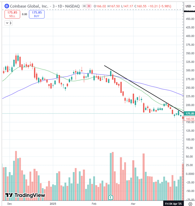
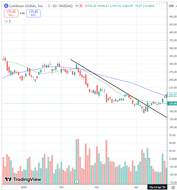
Here we see Coinbase (COIN) forming a downtrend line in March 2025 with several touches on the daily timeframe chart.
Quite often, the downtrend line and the 20-day moving average (green line) follow the same trajectory.
The 50-day moving average (blue line) is also sloping down, confirming that Coinbase is in a downtrend.
Not the time to buy the stock.
The first signal an investor should look for is an upward break of this trendline.
That happened on April 9th, 2025, when the green candle closed above the trendline…
This is still too early.
But it is a good time to put this stock on a watch list.
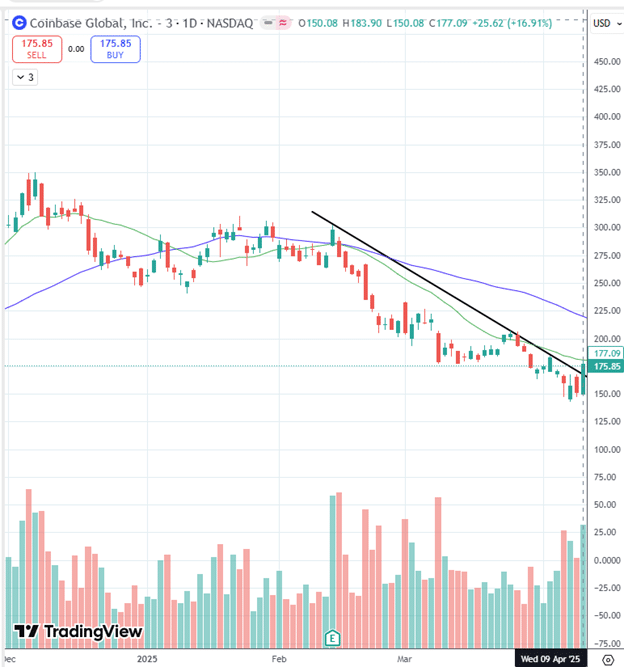
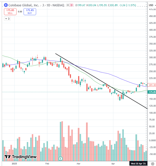
On April 22nd and April 24th, the stock closed above the 20-day moving average and then the 50-day moving average…
This is looking promising.
And early investors may be starting to take partial positions.
On April 30th, the 20-day moving average has rounded the bottom and has turned up…
The 50-day moving average is still sloping down and takes longer to turn around.
The 20-day average is like a speedboat that can make turns faster.
While the 50-day is like a cruise ship, it’s more difficult to turn.
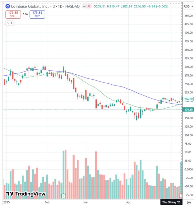
On May 8th, the 20-day moving average crossed above the 50-day moving average.
For some investors, this is a buy signal.
Noting the “E” icon at the bottom of the chart, Coinbase is about to announce earnings after the market close on May 8th.
An investor who doesn’t want to take earnings risk will want to wait another day before buying.
Post-earnings, the stock continues to hold above the 20 and 50-day moving averages.
There was a spike in volume on the bullish days of May 13th and May 16th.
At this point, we can safely say that the stock has turned the corner and is about to start its uptrend.
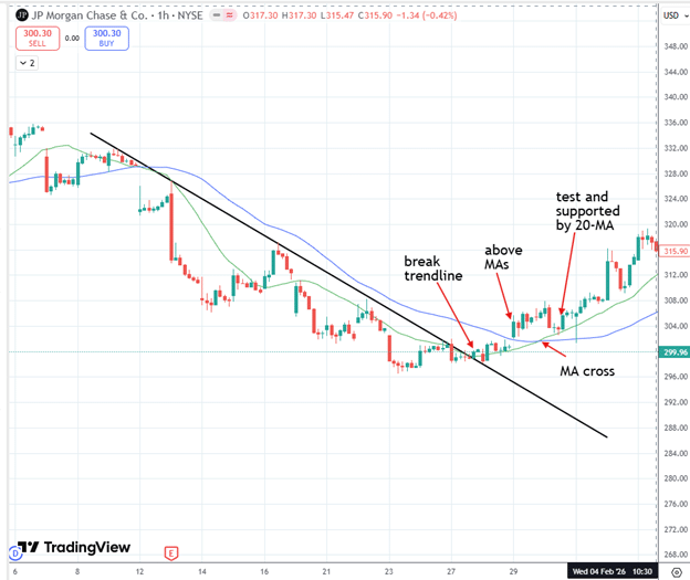
Yes, the pattern can be seen in other timeframes.
Here is a one-hour chart of JPM…
Each candle represents one hour instead of one day.
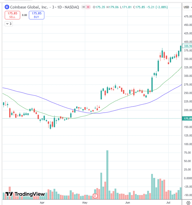
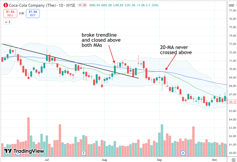
Below is an example of Coca-Cola (KO) that looked like it was going to work, but it didn’t go very far…
It broke the trendline and crossed above both moving averages on August 7th, 2025, but it didn’t go any further.
We see that ultimately, the 20-day moving average never crossed above the 50-day moving average.
The pattern appears to work the majority of the time.
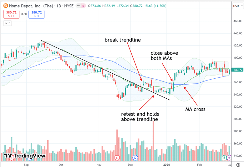
To summarize what to look for, here’s the pattern of Home Depot (HD) making a turnaround in early 2026
See how it broke the downtrend line.
Then it retests and holds above the trend line.
The trendline that had been resistance for the stock is now acting as support.
On January 8th, HD closes above the 20-day and 50-day moving averages.
And shortly thereafter, the 20-day moving average has cupped around and crossed above the 50-day moving average.
Now that you know what evidence to look for in a stock turnaround, it is the trader’s discretion as to when in the process they want to buy.
Some may want to buy early in the process, while others want to gather more confirming evidence before they buy.
We hope you enjoyed this article on identifying stock turnarounds with moving averages.
If you have any questions, please send an email or leave a comment below.
Trade safe!
Disclaimer: The information above is for educational purposes only and should not be treated as investment advice. The strategy presented would not be suitable for investors who are not familiar with exchange traded options. Any readers interested in this strategy should do their own research and seek advice from a licensed financial adviser.

Source link