How To Read Options Payoff Diagrams: Complete Guide For Beginners
If you can’t read an options payoff diagram, you’re trading blind.
These diagrams and charts may look slightly different on different trading platforms.
Once we look at a few, you will see the concept is the same.
Some brokerages or options trading platforms may not provide you with payoff charts.
In that case, there are options analysis tools that one can use (some of which are partially free and some paid versions).
A good tool that provides payoff diagrams for free is OptionStrat.
You may not see the words “payoff diagram” in their description, as they use “visualization tools” and “profit calculator” instead.
Other tools may use terms such as risk graph, analysis chart, expiration graph, and so on.
They all mean the same.
In this guide, I’ll show you exactly how to read payoff diagrams on any platform, what the different lines and curves mean, and most importantly, how to use these diagrams to make better trading decisions.
Contents
Reading payoff diagrams is an essential skill for any options trader.
These visualizations instantly show you:
- Maximum profit – The highest point on the graph
- Maximum loss – The lowest point on the graph
- Breakeven points – Where the line crosses zero
- Directional bias – Whether you profit from up, down, or sideways moves
- Time decay impact – How your P&L changes as expiration approaches
- Volatility sensitivity – How IV changes affect your position
Without understanding these diagrams, you’re making decisions based on incomplete information.
It’s like driving without being able to read your dashboard – technically possible, but unnecessarily risky.
Some brokerages or options trading platforms may not provide payoff charts.
In that case, there are analysis tools you can use (some are partially free, some are paid).
Free Options:
OptionStrat – Excellent free tool with comprehensive visualization. They call it “visualization tools” and “profit calculator” rather than “payoff diagram,” but it’s the same thing.
Paid Options:
Other tools may use different terms:
- Risk graph
- Analysis chart
- Expiration graph
- P&L diagram
They all mean the same thing – a visual representation of how your position’s profit/loss changes with different variables.
For this guide, we’ll use OptionStrat since it’s free and beginner-friendly.
Before we dive into specific examples, understand these universal elements present in all payoff diagrams:
The X-Axis (Horizontal): Stock price
- Shows the price of the underlying stock
- Current price. Usually marked with a vertical line
The Y-Axis (Vertical): Profit/Loss (P&L)
- Shows your profit (above zero) or loss (below zero)
- Usually shown on the left side of the graph
The Payoff Curve:
- Shows P&L at different stock prices
- Green portion = profit
- Red portion = loss
Breakeven Points:
- Where the curve crosses the zero line
- Typically marked with vertical lines
Time Slider:
- Let’s you see how the payoff changes over time
- Fully right = at expiration
- Fully left = today (T+0)
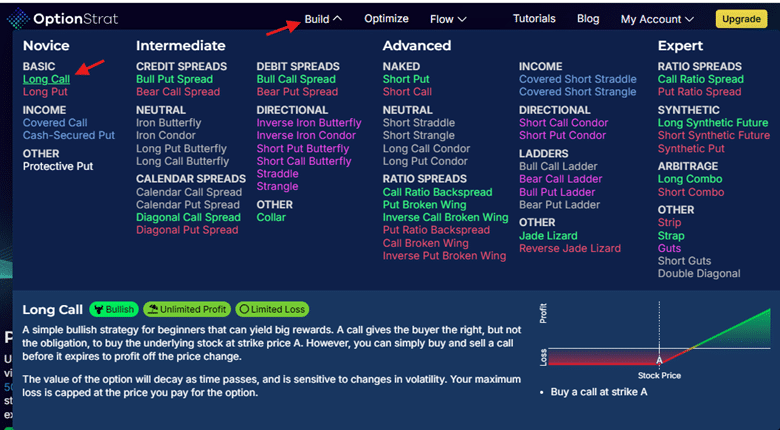
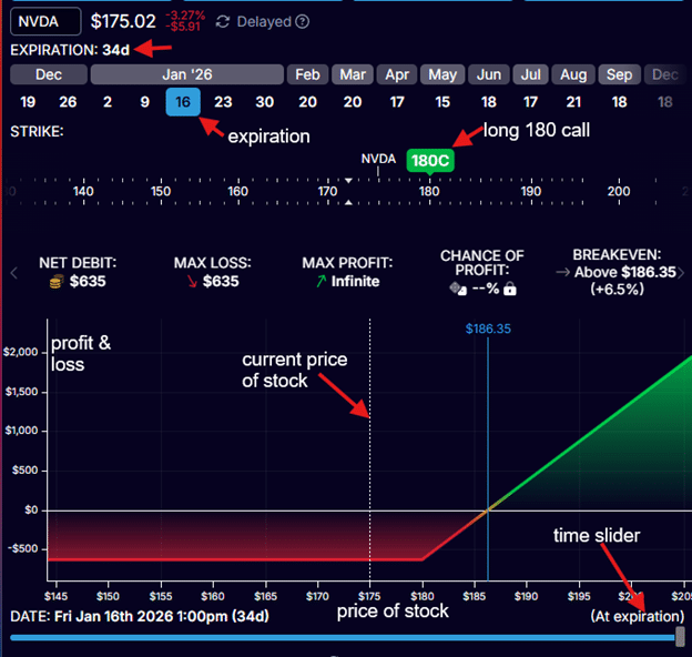
Using only the free version of OptionStrat, we can click on “Build” a “Long Call”.
This is a good educational tool because it provides a description of the various option structures, whether they are bullish/bearish, and whether they have limited/unlimited risk.
After typing in NVDA into the ticker symbol box, we click on the “graph” button and see the payoff diagram of a long call option in Nvidia stock.
We want to buy a long call option with a strike price of $180 that expires on January 16th, 2026 (which is 34 days away).
We selected January 16th as the option’s expiration date.
We moved the green tab to a strike price of $180.
This $180 long call option is indicated by the green marker “180C” above the price ribbon.
If it was a put, you would see “P” instead of “C”.
In OptionStrat, options bought are shown above the price ribbon, and options sold are shown below the ribbon.
By doing so, OptionStrat has told us that the price of the option contract is $635.
Please note that this price information is delayed data (for the free version of OptionStrat) and does not represent the price at which the live trade would be filled due to slippage, bid-ask spread, and other market factors.
Lastly, we slide the “time slider” (at the bottom) all the way to the right to instruct OptionStrat to draw the payoff graph at expiration.
The important thing to understand with all these payoff graphs is that the horizontal x-axis at the bottom indicates the price of the underlying stock.
The profit and loss (P&L) is indicated by the vertical y-axis (shown on the left side of the graph).
NVIDIA’s stock is currently trading at $175 per share today, December 13th, 2025.
The white vertical line at the center of the graph indicates the price of $175.
We have now given OptionStrat all the inputs needed to draw the payoff chart:
- Underlying stock symbol
- Strike price of call or put option
- Whether the option was bought or sold
- Expiration date of option
- Payoff graph at which point in time
In this first example, we want the payoff graph at the time of expiration (which is January 16, 2026).
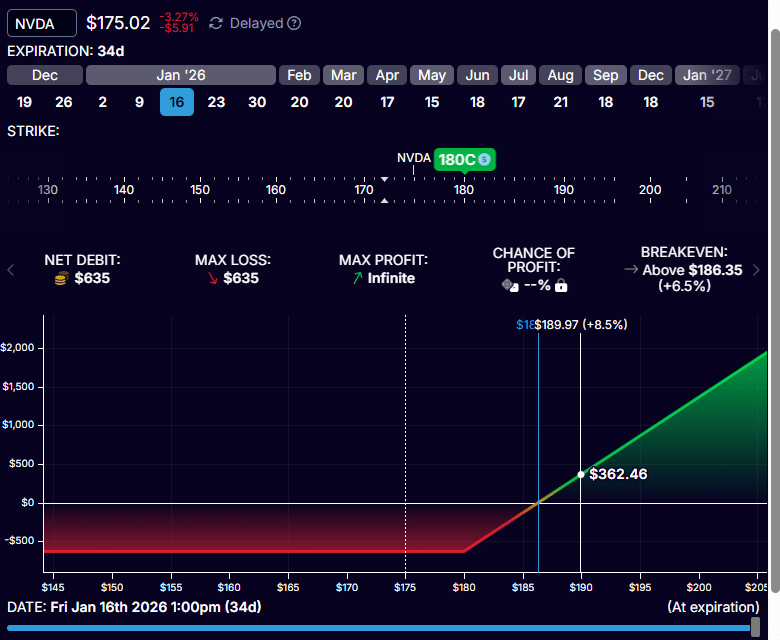
If, on January 16th, 2026, NVDA stock is at $190 per share, the profit on our long call option will be $362.40, as shown on the graph:
The investor who bought the long $180 call for $635 a contract can purchase 100 shares of NVDA for $180 per share.
With NVDA trading at $190 per share, that is a profit of $10 per share (or $1000 per contract) minus the cost of purchasing the option.
P&L = $1000 – $635 = $365
Instead of computing this number, we can see this number from the expiration payoff graph above.
It is not exactly $365 only because I was not able to position the cursor right at the price of $190.
In addition, OptionStrat shows that NVDA would have to make an 8.5% upmove in 34 days in order to reach that profit.
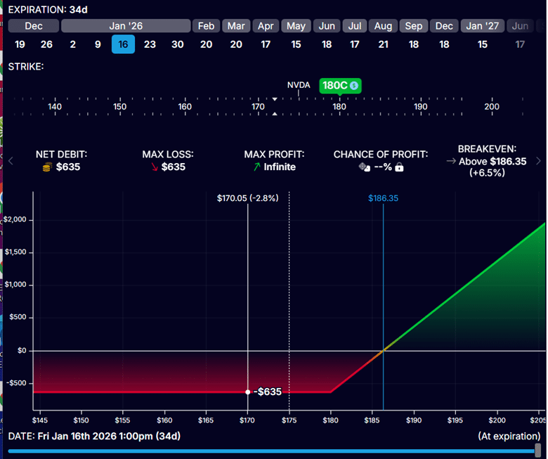
What if NVDA went down instead of up?
From the red portion of the graph, we see that if NVDA is anywhere below $180, we would lose $635.
This includes the scenario where NVDA didn’t move and stayed at $175 per share.
How far up does NVDA need to move for us to break even on the trade (not lose any money nor make any money)?
The analysis software calculates that for us, as shown in the blue vertical line.
It is when NVDA goes to $186.35 at expiration.
When that happens, the owner of the call option is able to buy 100 shares of NVDA at $180 when its price is trading at $186.35 – a profit of $6.35 per share.
This would be a profit of $635 per contract – just enough to cover the cost of the call option.
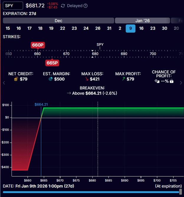
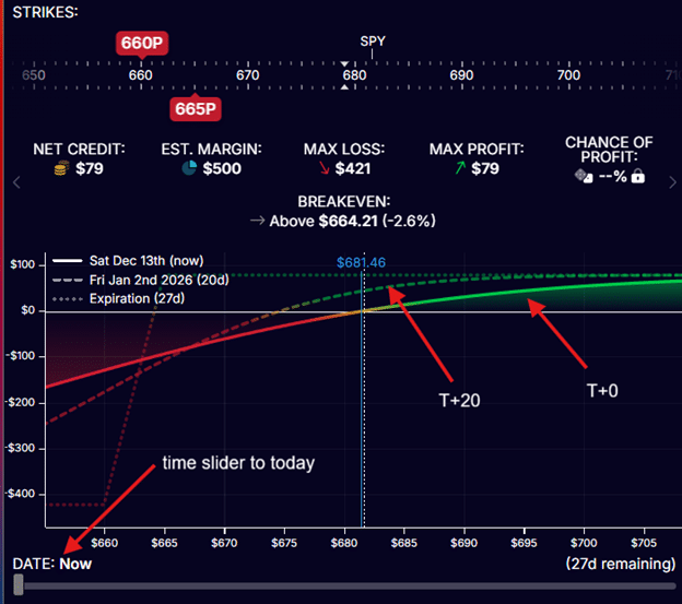
Below, we are selling a bull put credit spread on SPY (S&P 500 ETF) with 27 days till expiration.
We are selling the 665 put option and buying the 660 put.
We collect a credit of $79 and have a max risk of $421.
There is no point on this graph where the P&L is lower than -$421.
From the blue vertical line, we see that as long as SPY stays above $664.21 at expiration on January 9th, 2026, the trade will be profitable.
The trade will take the maximum profit of $79 if SPY is above $665 at expiration.
This is the maximum profit possible because there is no point on this graph that goes above $665 in P&L.
The payoff diagram will change with time.
What we have seen is the payoff chart at expiration.
The payoff graph at the start of the trade instead looks like this:
This is the T+0 payoff graph, which I was able to display by sliding the time slider all the way to the left.
T+0 means “today plus zero days” (or right now).
This is why it is also called the “today graph”.
Looking at the T+0 curve, it shows that as the price of SPY increases to the right, the P&L will go up (see the green colored portion of the curve).
If the price of SPY drops, the P&L will drop (indicated by the red colored portion).
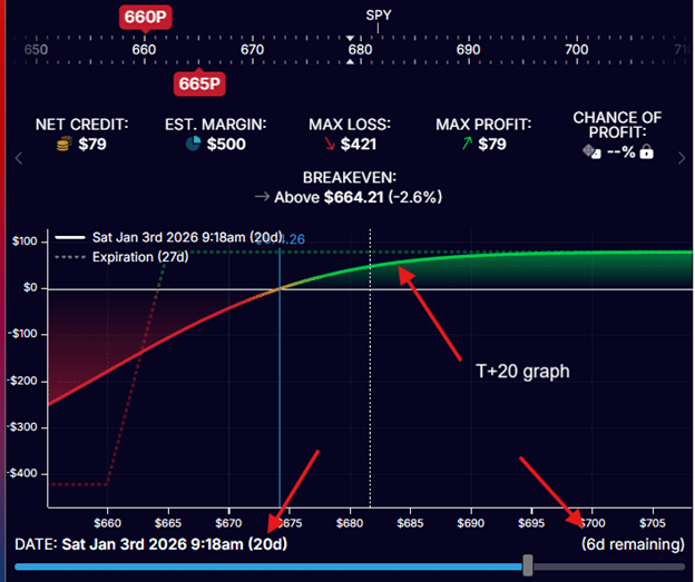
In the above, there is a dotted curve which shows the payoff graph 20 days from now (the T+20 graph).
If you slide the time slider 20 days ahead, you will get the same T+20 curve (shown below).
As time advances, this curve will change and morph into the expiration graph.
You can see this as you continue to slide the time slider to the right.
Payoff graphs not only change with time, but they also change with implied volatility changes.
Implied volatility is a characteristic of options that affects their pricing.
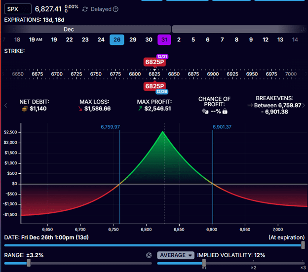
Let’s look at a calendar time spread on the SPX (S&P 500 index).
We are selling the 6825 put option expiring on December 26th, 2026.
This is the short option.
We are buying the 6825 put option expiration on December 31st, 2026.
This is the long option.
Time spreads have options with two different expiration dates.
In this case, the expirations are 13 days and 18 days from today.
When we slide the time slider all the way to the right, we see the payoff graph of the time spread at the short option’s expiration.
See that the Date on the lower left says “Dec 26,” which is the expiration of the short option.
The vertical blue lines tell us that the trade will be profitable as long as SPX stays between 6760 and 6901 on December 26th.
The values 6760 and 6901 are known as the expiration break-even points.
These are the prices at which the expiration graph crosses the zero-profit horizontal.
This assumes that the implied volatility of both options remains the same, which it will not.
Currently, the average implied volatility of both options is 12% (see screenshot above).
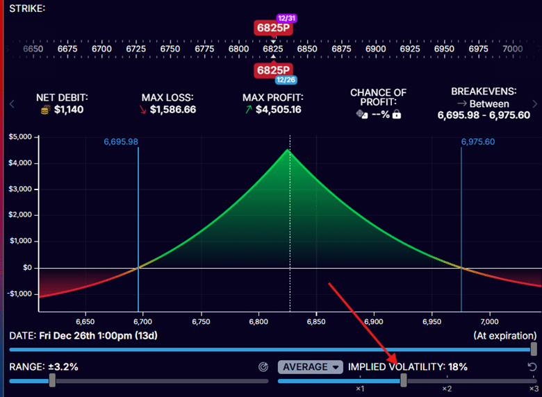
What happens if implied volatility increases by 1.5 times?
This can be modelled by sliding the volatility slider to the right to 18%
Did the payoff graph change?
Yes, it did.
See that the expiration breakeven points are now 6696 and 6975.60.
At the same time, they were 6760 and 6901 previously.
As implied volatility increased, the range between the breakeven points widened, causing the payoff graph to expand.
For option structures with legs that expire on different dates, the expiration payoff graphs are influenced by implied volatility.
In contrast, option structures where all legs share the same expiration date have fixed expiration payoff graphs that do not change with implied volatility.
This is because implied volatility effectively drops to zero at expiration.
However, the T-curves (such as T+0, T+20, T+x, and so on) are affected by changes in implied volatility for all option structures, regardless of whether the legs expire on the same date.
Mistake 1: Ignoring the Time Slider Position
Beginners look at the curved T+0 line and think, “This is what happens.” Then they’re shocked when expiration approaches and the curve flattens.
Fix: Always note whether you’re looking at T+0, T+X, or expiration. They’re completely different scenarios.
Mistake 2: Assuming Maximum Profit Is Achievable
The diagram shows maximum profit at expiration, but many trades never reach max profit because:
- Theta decay works slowly
- Traders close early at 50-75% profit
- Adjustments cap potential gains
Fix: Set realistic profit targets based on the time available and your trading plan.
Mistake 3: Forgetting About Commissions and Slippage
The diagram doesn’t account for:
- Opening commissions
- Closing commissions
- Bid-ask spread slippage
A trade showing $50 profit on the diagram might only net $30 after costs.
Fix: Subtract estimated trading costs mentally when evaluating small profit opportunities.
Mistake 4: Misreading Breakeven vs Profit Target
Breakeven is where you don’t lose money – it’s not where you want to exit! Many traders confuse “breakeven price” with “target price.”
Fix: Breakeven = minimum acceptable outcome. Target = where you actually want the stock to go.
Mistake 5: Ignoring Implied Volatility Assumptions
For time spreads, the diagram assumes current IV levels persist. If IV collapses or spikes, your actual P&L will differ significantly from the diagram.
Fix: Use the IV slider to model different scenarios, especially before major events like earnings.
Mistake 6: Not Checking T+0 for Early Exits
You planned to hold to expiration, but news comes out, and you need to exit today. The T+0 curve shows a dramatically different P&L than the expiration.
Fix: Always check the T+0 curve before entering – it shows your “emergency exit” scenario.
Q: Do I need to use payoff diagrams for every trade?
For beginners, yes. Experienced traders can visualize simple structures mentally, but even pros use diagrams for complex trades or when testing adjustments. The few seconds it takes to check a diagram can save you from costly mistakes. As you gain experience with common strategies like credit spreads or iron condors, you’ll need them less frequently for routine trades.
Q: Why do free platforms show delayed data?
Free tools like OptionStrat use delayed market data (typically 15-20 minutes behind) because real-time data requires expensive exchange fees. For planning and education, delayed data is fine. For actual trade execution, use your broker’s real-time quotes. The diagram shape and concept remain the same – just the specific numbers change slightly.
Q: What’s the difference between expiration and T+0 graphs?
The expiration graph shows P&L if you hold until expiration – it’s made of straight lines because options have only intrinsic value then. The T+0 graph shows P&L if you closed the position right now – it’s curved because options still have time value. Most traders actually close positions somewhere between T+0 and expiration, so understanding both is crucial.
Q: How do I know which time (T+X) to look at?
It depends on your holding period. If you plan to close at 50% profit, slide the time slider around to see when that typically occurs (often at T+20 to T+30 for 45-day options). If you’re holding to expiration, focus on the expiration graph. Many traders check both the T+0 (emergency exit) and expiration (ideal hold) scenarios before entering.
Q: Can I trust the profit numbers shown on diagrams?
Use them as estimates, not guarantees. The diagrams assume current IV persists, ignore commissions, and don’t account for bid-ask spread. Real P&L will differ slightly. For time spreads, especially, actual results can vary significantly from diagrams if implied volatility changes dramatically. Always build in a margin of safety.
Q: What if my broker doesn’t provide payoff diagrams?
Use free tools like OptionStrat or open a paper trading account with Think or Swim (free with TD Ameritrade) or Interactive Brokers. You can plan trades in these tools, then execute them in your actual brokerage account. Never trade options without understanding the payoff diagram – it’s like flying blind.
Q: How does the diagram help with position sizing?
The maximum loss shown on the diagram tells you your capital at risk. Using proper position sizing rules (typically 2-5% of account per trade), you can calculate how many contracts to trade. Example: $25,000 account, 5% max risk = $1,250. If the diagram shows a max loss of -$421, you can trade 2-3 contracts at most.
Q: Do professional traders use these diagrams?
Absolutely. Market makers and professional options traders use sophisticated versions of these diagrams (often called “risk graphs” in professional settings) to manage complex portfolios. The concepts are identical – they’re just using institutional-grade software. If professionals rely on them, beginners definitely should.
Options pricing depends on many factors.
The P&L effect gets even more complicated when you combine multiple options into structures such as credit spreads, iron condors, and time spreads.
Analytical software that renders payoff diagrams will help us understand how the P&L of our option structure will be affected as the price of the underlying stock moves.
Payoff diagrams help you understand how your option structure’s P&L changes as variables shift:
- Stock price movement
- Passage of time
- Changes in implied volatility
Study the payoff diagrams as you adjust the various inputs in your analytical software, and you will begin to understand this better.
Understanding payoff diagrams is fundamental, but it’s just the beginning.
If you want systematic approaches to trading options with proper risk management:
Options Income Mastery: Learn proven strategies, including credit spreads, iron condors, and the wheel, with complete P&L analysis ($397)
The Accelerator Program: Advanced training covering complex strategies, adjustments, and portfolio-level management ($997)
We hope you enjoyed this article on how to read options payoff charts and diagrams.
If you have any questions, please send an email or leave a comment below.
Trade safe!
Disclaimer: The information above is for educational purposes only and should not be treated as investment advice. The strategy presented would not be suitable for investors who are not familiar with exchange traded options. Any readers interested in this strategy should do their own research and seek advice from a licensed financial adviser.

Source link