Raindrop Charts: TrendSpider’s Unique Charting Tutorial
You want a clearer sense of how price and volume actually interact—not just another candlestick chart. TrendSpider’s Raindrop Charts give you that by blending price action with volume distribution on both sides of each bar.
With Raindrop Charts, you get to see where buyers and sellers really traded, not just where prices closed.
When you visualize volume directly within each period, you’ll spot shifts in sentiment and momentum that traditional charts often gloss over. You can spot potential breakouts, confirm support and resistance, and check whether volume supports a move.
Pair Raindrop Charts with tools like Stock Rover for deeper stock research, and you start connecting technical signals with fundamental context.
I will show you how to use Raindrops to refine your entries, exits, and risk levels across stocks, ETFs, or even crypto pairs. Once you know how each Raindrop forms, reading the market’s balance of power just feels more natural.
Key Takeaways
- Raindrop Charts combine price and volume to reveal trading sentiment.
- You get a visual read on breakout zones and trend shifts.
- Integrating Raindrop analysis with research tools can strengthen your trade decisions.
What Are TrendSpider Raindrop Charts?
TrendSpider’s Raindrop Charts mix price action, volume, and VWAP data into a single visual format, making it easier to see where market interest really sits. You don’t get arbitrary open and close prices—instead, you see volume-weighted data, which gives a more objective sense of market sentiment and the balance between buyers and sellers.
Origins and Development
TrendSpider rolled out Raindrop Charts in 2018, aiming to modernize technical analysis. They wanted to cut the noise from traditional candlestick charts and highlight where volume actually traded within each time period.
Developers built the format to merge price and volume data directly into each candle. This lets you see not just where prices moved, but where traders actually got involved.
That approach helps you spot support, resistance, and trend strength with fewer assumptions.
Raindrop Charts caught on quickly among traders using TrendSpider’s automated analysis tools. Now, you can integrate Raindrops with features like auto trendline detection and multi-timeframe analysis. You get a more complete sense of market structure before making a move.
How Raindrop Charts Differ from Candlestick Charts
A candlestick chart gives you four fixed data points—open, high, low, and close—for each interval. A Raindrop Chart splits the period in half, with each side weighted by volume instead of time.
That design removes the emotional bias in open and close prices. You see where trading activity is concentrated, which often matters more than where prices started or ended.
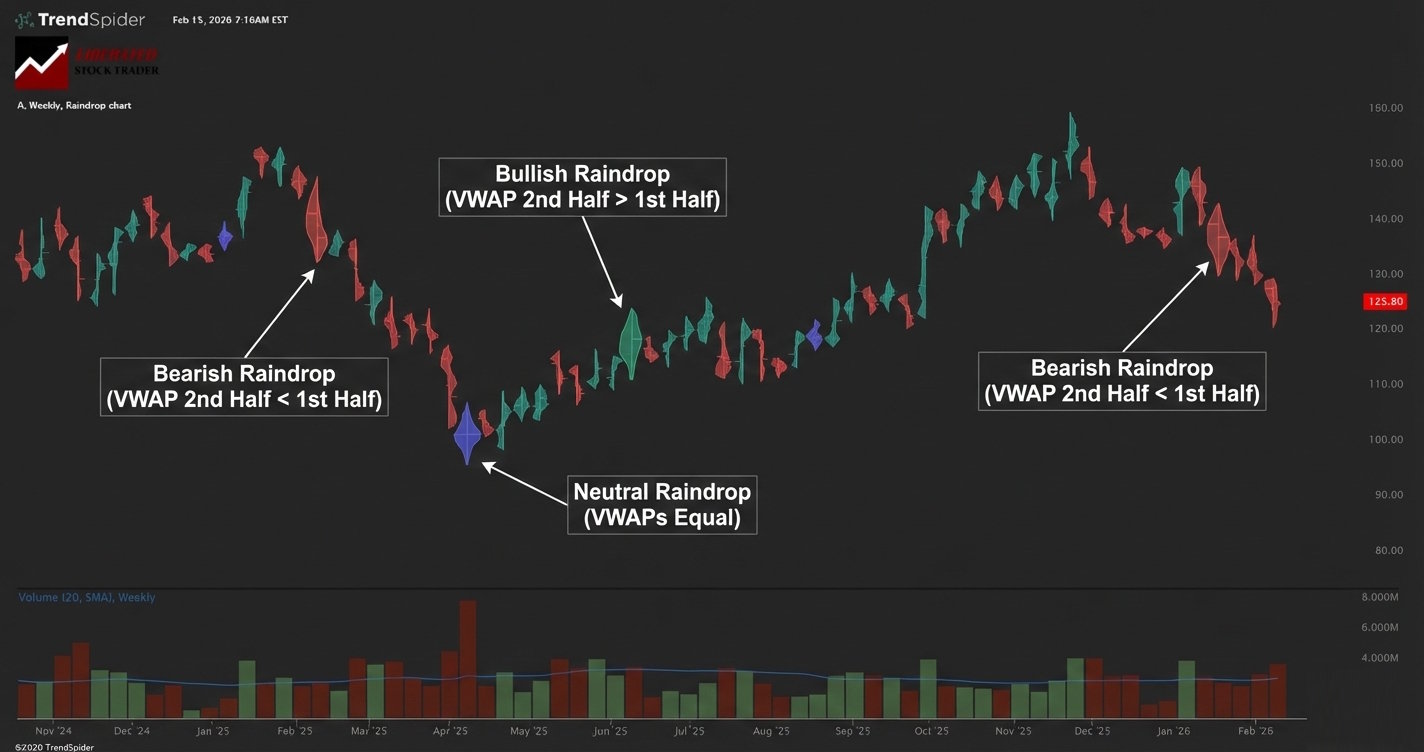
In practice, Raindrop Charts reveal volume imbalances that traditional candles just hide. If the right half of a raindrop is bigger, buyers took over late in the session. When both sides are about equal, the market reaches equilibrium.
You can test these insights with other chart types in TradingView to check for consistency across platforms.
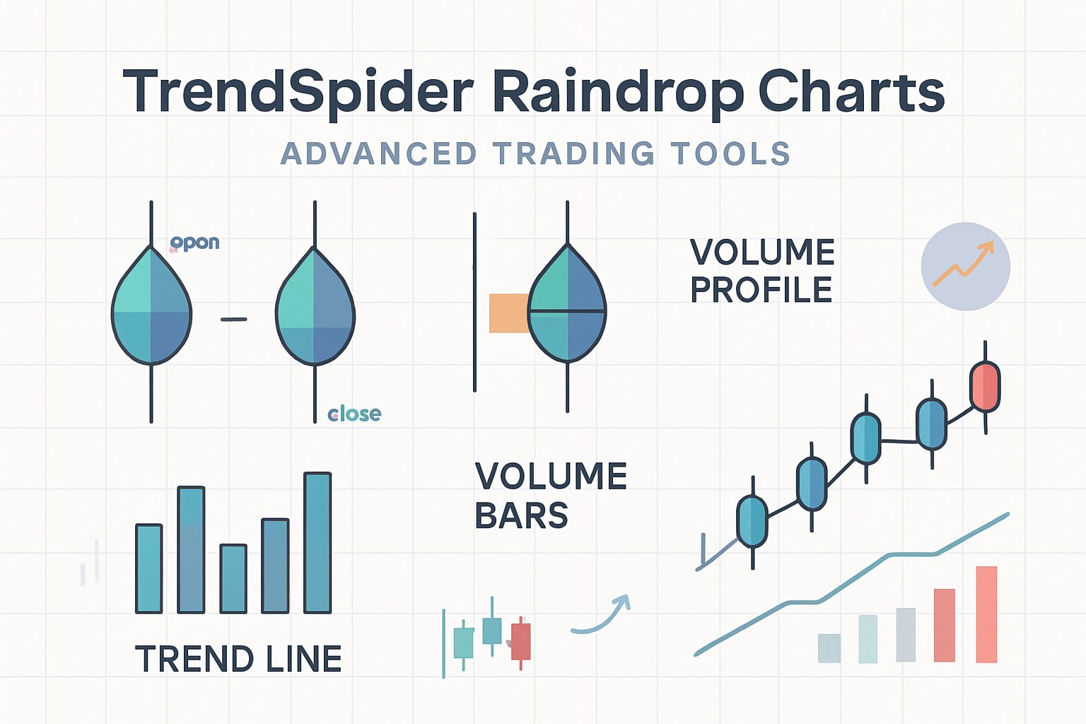
Key Components: VWAP, Volume Profile, and Dashes
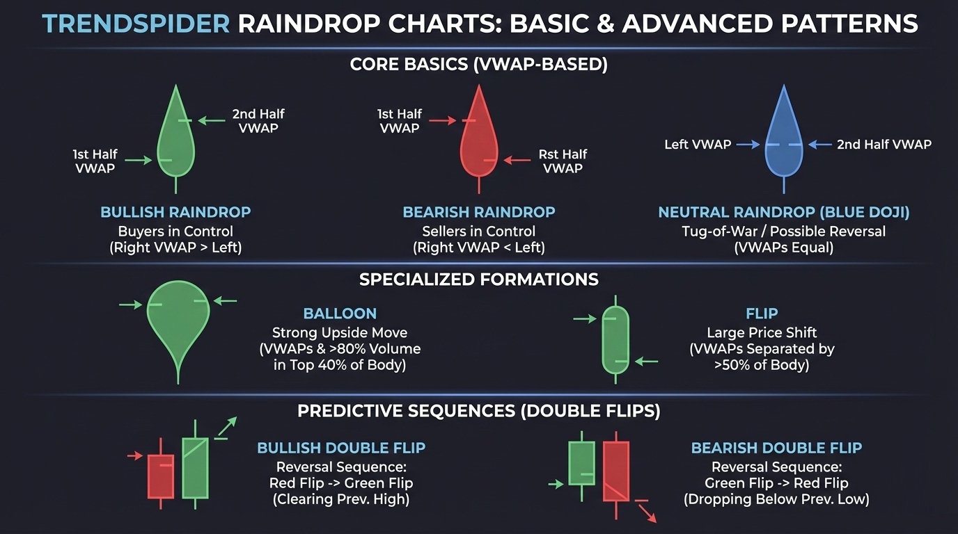
Each Raindrop has three main elements: VWAP (Volume-Weighted Average Price), volume profile, and price dashes. These map both the price range and the trader’s commitment within a single candle.
- VWAP line: Shows the average price weighted by volume for that period. It’s kind of a balance point between buyers and sellers.
- Volume profile: The width of each half indicates the volume traded at different price levels. Wider parts mean heavier participation.
- Dashes: Mark the highest and lowest traded prices during that period, a quick way to spot volatility.
Read these together, and you’ll see if momentum lines up with volume, or if a move just lacks conviction. With TrendSpider’s automation tools, you can overlay VWAP bands or alerts to track shifts in sentiment—no more manual redrawing.
How to Read and Interpret Raindrop Charts
Raindrop charts combine price movement and volume data into a single view, showing how buyers and sellers interact within each period. You see where volume clusters, how sentiment changes during a session, and whether a price level really acts as support or resistance.
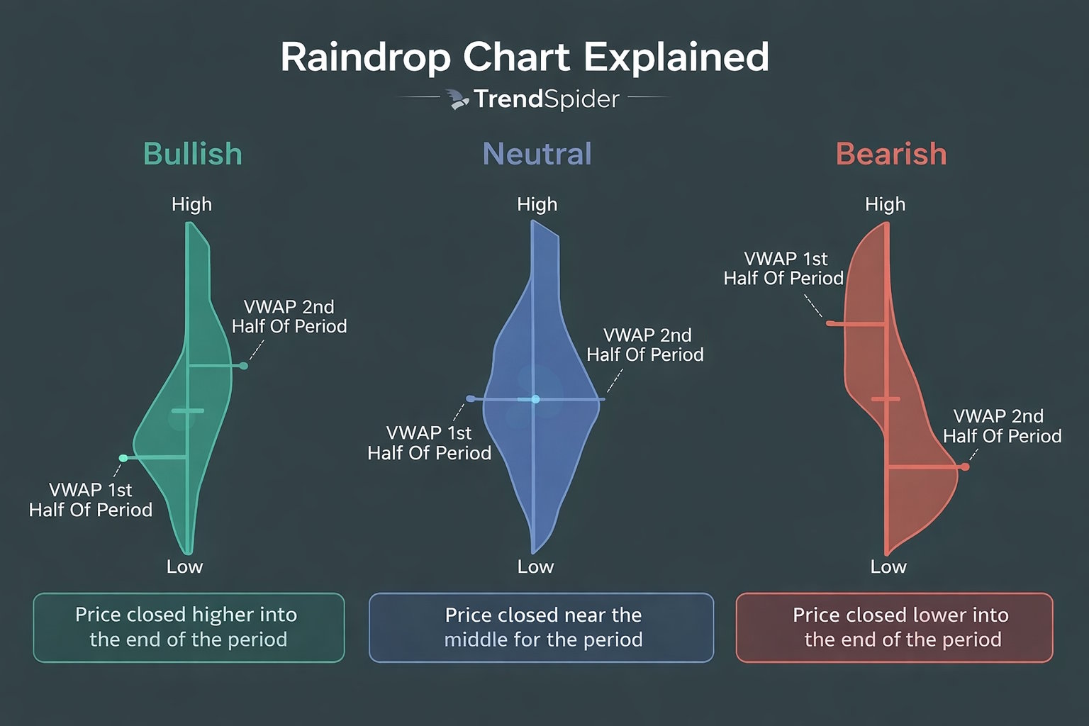
Left Dash and Right Dash Explained
Each Raindrop has two vertical dashes—left and right—that show the volume-weighted average price (VWAP) for the first and second half of the timeframe.
The left dash shows where trading volume clustered early in the period. The right dash tracks where volume shifted later.
When the right dash sits higher than the left, buyers gained control. If it’s lower, sellers took over.
You can use the space between these dashes as a visual cue for market sentiment. A wide gap signals strong conviction; a narrow one hints at indecision.
| Dash | Represents | Interpretation |
|---|---|---|
| Left | VWAP in the second half | Early session sentiment |
| Right | VWAP in second half | Late session sentiment |
With TrendSpider, overlay automated raindrop patterns to check how these dashes line up with key resistance levels or trendlines.
Volume Shading and Price Levels
The body of each Raindrop shows how volume is distributed across price levels. Darker or thicker sections mean more trades happened at that price. Lighter parts mean thin participation.
This volume profile helps you spot where liquidity is pooled. High-volume zones often turn into short-term support or resistance. Low-volume gaps? Those might move faster when tested again.
Watch how the shaded area shifts between raindrops. If volume starts clustering near higher prices, that’s usually a sign of accumulation. If it’s heavier near lows, you might be seeing distribution.
For deeper analysis, cross-check these readings in TradingView with its volume profile indicator. That way, you see if the same price levels attract activity on different timeframes.
Color Coding: Bullish, Bearish, and Blue Raindrops
Raindrops use color to sum up sentiment in each bar. A green (bullish) raindrop shows the right dash is higher than the left—upward momentum. A red (bearish) Raindrop means the right dash is lower, which points to selling strength.
A blue raindrop signals equilibrium—buyers and sellers traded evenly, and volume centered around a balanced price. Blue raindrops often pop up before breakouts or reversals, especially when you see a volume spike.
Color works best alongside raindrop patterns and trendline analysis. For example, a cluster of blue raindrops near resistance may indicate that sentiment is shifting. You can automate this in TrendSpider to spot breakout setups before they trigger.
Raindrop Chart Patterns and Signals
Raindrop patterns merge price and volume to show where buyers and sellers put their weight within each period. You’ll spot shifts in sentiment, volume concentration, and likely continuation or reversal points by reading these shapes right.
Blue Doji and Market Indecision
A Blue Doji in Raindrop charts signals a balance between buyers and sellers. It occurs when the left and right volume distributions are nearly equal, so neither side dominates.
You’ll often see Blue Dojis at key support or resistance. When price consolidates and volume spreads evenly, the market pauses before picking a direction.
In TrendSpider, highlight Blue Dojis automatically with the Raindrop Pattern Scanner. Pair this with VWAP or anchored volume-by-price to assess whether indecision occurs at a meaningful level.
| Indicator | What It Suggests |
|---|---|
| Blue Doji color | Equal buyer-seller volume |
| Narrow shape | Low volatility |
| Appears near support/resistance | Potential breakout setup |
Watch for the next candle or Raindrop to break above or below the Blue Doji midpoint. That’s your confirmation for the next move.
Flips and Double Flips
Flips happen when the volume-weighted center of a Raindrop moves from one side of the bar to the other. That shift shows a change in control—buyers taking over from sellers or vice versa.
A Double Flip is when this reversal happens twice in a row. The first flip hints at a shift, the second confirms the new direction.
Classify them as bullish double flips if volume moves from the left (selling) to the right (buying), and bearish double flips for the opposite.
In TrendSpider’s Strategy Tester, backtest flip frequency and performance. Add volume filters to avoid false signals during thin trading.
| Type | Volume Shift | Typical Outcome |
|---|---|---|
| Bullish Double Flip | Left → Right | Uptrend continuation |
| Bearish Double Flip | Right → Left | Downtrend continuation |
Balloon Patterns
Balloon patterns appear when one half of the Raindrop bulges outward, indicating significant volume at a single price. This shape often marks accumulation or distribution before a breakout.
A left-heavy balloon signals early buying pressure that fades by the close. A right-heavy balloon shows strong demand into the finish.
Analyze these setups on TradingView for global equities or crypto, pairing Raindrop visuals from TrendSpider with volume profile overlays to confirm momentum.
Look for rising volume and a narrowing price range before a balloon breakout. If you see a balloon near resistance with fading volume, that might signal exhaustion.
| Balloon Type | Volume Bias | Possible Signal |
|---|---|---|
| Left-heavy | Early buying | Weak close |
| Right-heavy | Late buying | Strength into close |
Trend Reversal and Breakouts
Raindrop charts help you spot trend reversal points by combining price structure and volume placement when volume shifts from one side to another around a key level, which often comes right before a breakout or breakdown.
A reversal setup could show consecutive Blue Dojis, then a bullish double flip. You get breakout confirmation when the next Raindrop closes beyond the prior range with strong right-side volume.
Set up automated alerts in TrendSpider to catch these events in real time. For extra confirmation, check momentum indicators or Stock Rover fundamentals if you’re trading equities.
Before you act, make sure of three things:
- Volume concentration supports the move.
- Price breaks a clear technical level.
- The broader market trend lines up with your signal.
If all three check out, your odds of a sustained breakout go way up.
Practical Applications in Trading Strategies
Raindrop Charts blend volume-weighted price data with time-based visualization to help you interpret real market sentiment. Use them to compare price behavior, confirm key levels, and integrate automation across your trading platform for faster, data-driven decisions.
Comparing Raindrop Charts with Traditional Methods
Traditional candlestick charts show open, high, low, and close prices, but they don’t account for how volume shifts inside each period. Raindrop Charts replace static points with volume distribution across price ranges, so you can see where actual buying and selling occurred.
Take a symmetrical raindrop—it usually means sentiment’s balanced. If you spot a skewed one, that’s a sign of directional pressure, and it might help you sidestep those false breakouts that regular candles sometimes hide.
| Chart Type | Data Focus | Key Advantage |
|---|---|---|
| Candlestick | Price only | Simplicity |
| Raindrop | Price + Volume | Volume-weighted accuracy |
Go ahead and try both formats side by side on TrendSpider or TradingView. You’ll notice how volume-weighted visuals can shift your take on intraday trends.
Identifying Support and Resistance with Raindrops
Support and resistance really come down to where traders put their money. Raindrop Charts make these zones obvious by highlighting volume concentration at specific price levels inside each bar.
If you see heavy volume clustering near a flat midpoint, that’s often a stable support zone. A big upper-volume bulge? Sellers are likely in control, suggesting resistance. These details let you fine-tune your entries and exits much more effectively than drawing static lines.
Here’s a quick checklist:
- Check which way the volume bulge points.
- Look at more than one timeframe.
- Back it up with other indicators (think moving averages).
Platforms like TrendSpider can handle this for you by automatically detecting and labeling volume-weighted support and resistance zones—saving you significant time.
Integrating Raindrops into Automated Technical Analysis
Automation turns what you notice into something you can actually act on. You can feed Raindrop data into your automated technical analysis workflows to set off alerts, run backtests, or power trading bots.
For example, you could set up a rule to alert you when a raindrop shows a bullish skew above resistance with rising volume. That cuts down your reaction time and keeps you more disciplined.
TrendSpider’s scripting tools let you combine Raindrop signals with other triggers—trendline breaks, RSI levels, moving average crossovers, you name it. You can run these strategies on past data to see if they hold up before you commit real money.
If you want to scan across more markets, pair this with Trade Ideas for AI-driven trade discovery on multiple assets.
TrendSpider Tools and Platform Features
TrendSpider combines automation, data visualization, and testing tools into a single workspace. You can scan markets, backtest strategies, and compare different timeframes without bouncing between apps.
My research reveals that TrendSpider is an excellent choice for US traders seeking AI-driven tools for charting, pattern recognition, and backtesting across stocks, indices, futures, and currencies. The platform stands out by automatically detecting trendlines, Fibonacci levels, and candlestick patterns. With its robust backtesting capabilities and multi-timeframe analysis, TrendSpider is particularly well-suited for seasoned technical traders looking to refine their strategies.
Tested using rating system V3.
See the 2026 v3 58-point TrendSpider test and benchmarking.
Pros
✔ 150+ chart and candle patterns recognized
✔ True AI Model Training & Deployment
✔ AAA Point-and-click backtesting
✔ Auto-trading bots
✔ Multi-timeframe analysis
✔ Real-time data included
✔ US Stocks, ETFs, Forex, Crypto, & Futures
✔ Seasonality charts, options flow
✔ News & analyst ratings change scanning
✔ 1-on-1 training included
Cons
✘ Not ideal for value or dividend investors
✘ No social community or copy-trading
✘ Limited portfolio management tools

TrendSpider stands out by leveraging AI and machine learning to streamline traders’ workflow, bringing automated trend and pattern recognition to the forefront. With TrendSpider, traders gain access to advanced analysis and strategy-testing capabilities, surpassing manual efforts in both scale and efficiency.
FAQ
What are the key features of Raindrop Charts, and how can they enhance your trading strategy?
Raindrop Charts blend volume and price into a single candle, showing where most trading happened within each timeframe. Each “raindrop” splits into left and right halves—those represent volume distribution in the first and second half of the period.
You can see volume clusters, spot support and resistance, and confirm breakouts with more accuracy than regular candlesticks. Combine this with TrendSpider’s automated trendlines and alerts, and you’ll test ideas faster and cut down on subjective calls.
Can you utilize TrendSpider’s Raindrop Charts for free?
You get access to Raindrop Charts during TrendSpider’s free trial, but you’ll need a paid subscription to keep using them. The trial includes charting tools, automation, and alerts, but it doesn’t provide full data history or unlimited scans. After the trial, upgrading unlocks longer historical data, backtesting, and multi-chart layouts.
How do you interpret the volume profile within TrendSpider’s Raindrop Charts?
The width of each Raindrop indicates the trading volume at specific price levels. Wider spots mean heavier trading; narrower parts mean less.
If the left and right halves look different, that signals a shift in sentiment—maybe buyers or sellers are taking over. Volume-weighted midpoints help you assess whether momentum aligns with the overall price move.
What are some potential drawbacks of using TrendSpider for technical analysis?
TrendSpider’s automation cuts down on manual mistakes, but it doesn’t offer as much flexibility if you want to write your own scripts. The learning curve is steeper than basic charting tools, and subscriptions can get pricey for casual traders. If you prioritize fundamentals or valuation, you might want to use Stock Rover alongside TrendSpider’s technical features.
How does TrendSpider’s automated analysis compare with traditional manual charting methods?
TrendSpider’s automated analysis applies consistent logic to every chart, saving you time and reducing emotional bias. Manual charting, on the other hand, lets you dig in for deeper interpretation, but it takes longer and really depends on your own skill level.
Source link