Retrospective Pt. 3 (Crypto) – Fat Tail Daily

|
Four charts for you
Right now, I largely agree with the views we are hearing from our US analysts.
The current phase of the crypto market feels more like a shakeout than the start of the end times or a new winter.
My straightforward point is that many central bankers have significant ammo to cut rates further.
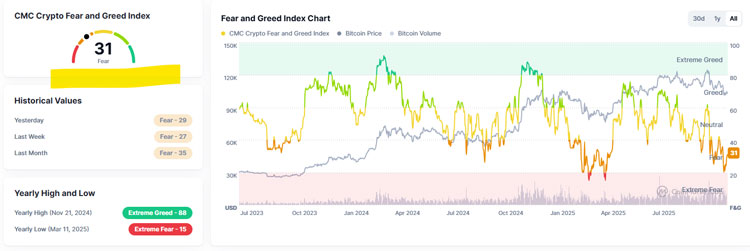
As risk assets, these should benefit from cuts. Right now, there is a lot of fear in the crypto market as you can see below:
Source: CoinMarketCap
[Click to open in a new window]
It currently has a reading of FEAR. However, that’s not nearly the lowest reading on the index this year, which was 15, relative to today’s 31.
So things may be on the up in the short to medium-term.
I would also draw your attention to four charts.
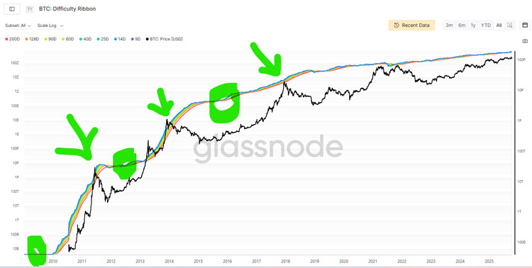
The first two charts are Glassnode’s BTC Difficulty Ribbon.
How to read this chart:
When the multicoloured ribbon compresses, mining is harder, meaning fewer coins become available on the market that have been recently minted.
Compression is often a leading indicator of various tops in the market, as you can see in the all-time chart below:
Source: Glassnode
[Click to open in a new window]
But what’s happening over the last ~3 years on the chart?
Source: Glassnode
[Click to open in a new window]
As above, you can see two compressions, two “tops”…and in yellow?
A widening of the ribbon.
For me, this means that we could be in for a potentially rocky spell over the short to medium term (for me, the next 6 months).
BTC is the lifeblood of the cryptocurrency market, and many traders and institutions leverage into altcoins against their BTC holdings.
When that gets chipped away at, it can have effects across the market as altcoin positions get de-leveraged — as we saw in the middle of last month.
For a more detailed discussion of the BTC Difficulty Ribbon chart, read this.
Now, there are reasons for significant optimism, too.
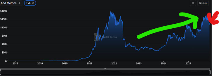
Here’s a chart from DeFiLlama on TVL:
Source: DeFiLlama
[Click to open in a new window]
TVL is Total Value Locked, and this chart represents all the money tied up in DeFi.
I use this as a barometer of altcoin health.
It has been trending strongly up the last ~3 years, but took a bit of a fall post the October de-leveraging event.
I don’t think we are a critical negative juncture yet, but if it continues to fall, we could be in danger of a more sustained period of coolness in the crypto market.
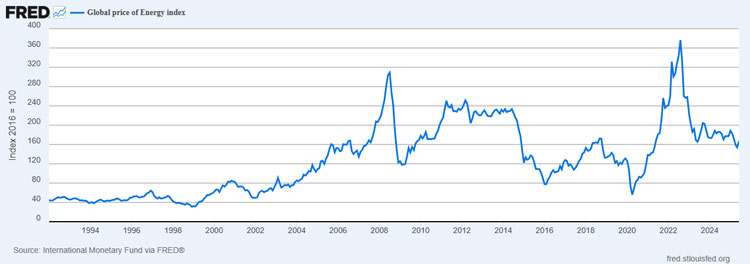
Finally, I want to point you towards a fourth chart.
Below is the global price of energy index published by the US Federal reserve:
Source: US Federal Reserve
[Click to open in a new window]
Energy prices have fallen significantly around the world, which is a good sign.
Why? Because BTC takes lots of energy to mine.
I am in contact with one particular crypto fund manager with ~US$50M under management.
He has custom indicators on when to buy and sell BTC, exclusively focused on energy prices.
It makes sense.
And in terms of the current energy market dynamics, they favour BTC over the long term.
Tomorrow’s note
Tomorrow we’ll hand things back over to Charlie Ormond, who has some interesting ideas on how the tail end of this year will play out for markets. And what could be coming next in 2026.
This is my final Chart of the Day for 2025 because I am wrapping things up at the end of this week and heading off on a cruise with the family.
So I thought I’d use the final instalment to make a prediction for next year.
One of the worst performing sectors this year was oil, and I am happy to say I don’t have any oil stocks in any of my portfolios.
Oil went into a long-term downtrend in January 2023, and I have had a bearish view on it since then.
But I think we may be getting close to the end of the bear market.
I still view the short-term risk as to the downside and consider a failure below US$59.00 in Brent crude oil as the possible starting gun to a sharp fall towards US$45.00-50.00.
But if we do see a fall of that magnitude quickly, I reckon that will be a great spot to start loading up on oil exposure.
The longer the oil price stays low the more high cost production will be switched off and the less exploration we will see.
OPEC+ will be keen to lower production if we do see further falls.
So I think 2026 will be the year that oil prices hit the low of the bear market and begin the next bull market.
You can see in the chart above how often prices have plunged into the buy zone over the past twenty years and then recovered.
I think we are close to seeing the same thing happen again.
Source link